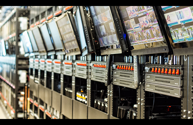
Great idea for 1984. A couple of thoughts: I would be curious to see what it would have looked like with the focus a little more to the left -- like on the 2nd or 3rd panel in from the right instead of focusing so far to the right. I do love the narrow depth of field, it's just that the focal point seems too far towards the edge of the picture to feel comfortable. I also would have been curious to see what the shot would have looked like if you would have stood on a stool or something to get a bit higher to get more of the screens. The bottom third of the photo isn't as interesting as the top. And I'm wondering if it would have been better if you were higher and had more of the front screens in the shot.
Team mate -- so not voting, but it would have been a 6 for good idea, but I think the composition could have been a bit better. :)
Great idea. I like it the way it is, and I don't know if the end of the picture is the end of the racks, but if possible it would have been great to have a different angle and pick up more of the hardware.
4...it's interesting, then again it's not. Maybe if there were a shallower depth of field, better light? Generally speaking, I find photographs of electronics kinda boring.
makes sense. the in focus spot seems at the wrong place. me eyes are trying to catch it but constantly fail. the border limits a bit the perspective. 6
Official deception, secret surveillance, and manipulation of the past by a totalitarian or authoritarian state isn't conveyed in this for me, looks more like a tv broadcast centre. But an interesting look.5.
It's one thing to show racks of what might be security/surveillance equipment and quite another to relate it to the story. The connection is missing here as far as I can see. There is nothing threatening as in the novel, just banks of equipment whose purpose is not clear in the image. Visually, is lacks a point of reference which could be achieved by closer point of view on something significant such as a camera or someone being spied upon in the monitors. It's an interesting subject, however, to which most of us may never have access and could use a lot of visual explaining. Look at all those red switches, for example. What do they do? How could you visually hint at their use? As is, the image doesn't tell us anything. 4
Just for this one time only, I am going to play border police. :) I normally have no problems with borders, but this one simly doesn't add any good points to your image. 5 from me.
Definitely see the Big Brother overtone in this. A very minor nitpick, but the dark frame on top and bottom could be a tiny thicker to give it more of the cinema feel. 7
Could be a page from his book anytime. As a photo, I am not impressed with it. I mean, outside of this challenge the photo does not stand on its own in my opinion.
5
This definitely seems like 1984! lol.
Like what you've done here. I would have liked to had seen a little more in focus... but perhaps for security reasons you couldn't? I can't tell exactly what this is.
Anyhow... overall this is a good image...
just a little "meh" for me.
Gave it a 5
Quite the array of monitors and hardware! 1984 was advanced beyond its years :) Not quite sure of the connection between the image and the book though?







 Add photograph to your favorites
 Add photographer to your favorites


 Photographer found comment helpful.


