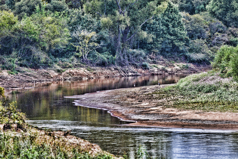
It's such a beautiful shot, but the processing has taken so much from it, imo. It looks like it would have such wonderful deep, rich tones that have been so washed out by being so bright. I think the over-sharpening could work if only it were darker and richer. -5-
It is probable the heavy HDR effect has improved this image but it doesn’t quite work for me. I feel this would have worked better without so much detail available in the shadows as it lacks depth. My eye gets drawn to the out-of-focus foreground as it is as bright, if not brighter than the areas I should be focusing on. 4. It is quite a nice location and the composition is good. The birds are a nice inclusion too. 4.
well it is a bend in the river, a rather nice one, but a little overshopped. I miss any more than nominal reference to the book, which makes me sad as I am a great fan of V.S. Naipaul. 4
Like so many images in this challenge, the topicality is lacking except in the most literal sense of the title. Using the title doesn't say much about drawing inspiration from the novel itself. The image itself is well detailed if a little bleached out in processing. Some find this attractive but not I. There are some potentially appealing birds but they're too small to count for much. 5
I want to like this one so much more than I actually do :-( What's NOT to like? A curving stream, some shorebirds, an interesting tree... The elements are here. The composition's decent. But the processing isn't doing this justice; you've used tone mapping to flatten the scene very unnaturally, and it's also feeling very "crunchy" as a result of too much added structure or local-area contrast.
But, beyond technical issues, there's nothing much in this image to serve as a focal point around which it can organize. That's not always a serious flaw, but the issue here is that there are so MANY details that we need at least ONE aspect of it to stand out and take control. If, for example, one of the birds were wading in the nearer foreground, that might help a lot.
Something looks wrong with the processing of the image...overprocessed maybe? The bottom left seems to have whatever it is the worst to me. Maybe it is nothing and that is just the way the foliage looks I don't know.
I like these scenes, but not the HDR effect. Good to see that you appreciate the variety of textures out there, the composition is balanced although I feel a little tilt to the left (maybe I'm the one tilted). The mood probably fits the first part of the story. The wild and undeveloped, but doesn't go much further than that as a connection, probably an old shack or muslim looking model somewhere, but I understand the constraints of trying to come up with that ;) 6. because I like the scene.
Seems a bit too much like a grab at the title and not so much the story. The processing on the back row of trees comes off well, but the middle and forward trees it doesn't work as well. I do like the herons on the bank, but not really relevant to this. 5
I like this shot and think it could have worked really well, but it's a little too harsh for my liking. A little too much on the tone mapping, IMHO.
The title is fitting. The colors are nice.
A little softer look and I would have scored it higher.
Gave it a 6
Nice capture of the rive that perfectly relates to your chosen book! The birds on the bank provide some added layers of interest! Only critique is the overuse of tonemapping, ad the trees and foliage have taken on an unnatural appearance. Tone that down slightly, and this would've been really good!
One of the most literal illustration of the title of a masterpiece that does not send me one bit to think of the novel.
The sharpening is way to pronounced, the foreground is unnecessarily blurry. I feel that you have to take the picture again to give justice to this place
4






 Add photograph to your favorites
 Add photographer to your favorites


 Photographer found comment helpful.


