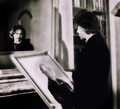
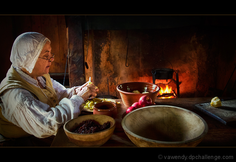
Yes, this was taken at Jamestown Settlement. It wasn't a setup shot, it is an historical interpreter at one of the reproduction forts.
I don't photograph the interpreters very often, and I didn't realize how difficult it really was. I'm not comfortable saying "hey, can you stop and pose for me", so I sit there with my camera, waiting for the ends of sentences, and pauses between words while they're speaking, to try to get the shot. Since they're usually talking while working, it's a lot more difficult than you think! Otherwise, they usually pose for the camera -- turning and smiling, which isn't what you're looking for.
The lighting in this particular building was wonderful, but very dim, so I had to shoot at 1000 ISO, but still had to try to catch her during pauses in speech, action, etc., since the shutter speed couldn't do it.
The commentor was right, the lighting on the face was done wrong in processing. It was a little too shadowed, and I tried to bring it out more, but over did it.
Thanks for all the comments -- both positive and critical. It's always interesting to get feedback.
The funny thing is: I loved the lone piece of fruit on the right. Since it's not staged, I had no control over that (except through cropping) -- but I adored that particular piece, so I left it in.
Regarding the letterbox. I wasn't crazy about that either, but the front of the fireplace was so dark, and the front bowl was cut off so abruptly, a 4x6 crop (or anything more) just had way too much dark space above, and really showed how badly I cropped in camera. The letterbox saved it a bit. Not the best save, but still a bit of a save. :)
Statistics
Place: 4 out of 86 Avg (all users): 7.0000 Avg (commenters): 6.7143 Avg (participants): 7.0244 Avg (non-participants): 6.9844 Views since voting: 1833 Views during voting: 236 Votes: 105 Comments: 30 Favorites: 0
Excellent lighting and composition. Love the action going on at the hearth. Would make a good cover - even with the letterbox format for I can see the title lettering at the top and the picture as a band that goes across below the middle of the cover. Congrats on 4th place finish.
Excellent lighting and composition. Love the action going on at the hearth. Would make a good cover - even with the letterbox format for I can see the title lettering at the top and the picture as a band that goes across below the middle of the cover. Congrats on 4th place finish.
Congrats on your HM Wendy. Interesting how one commenter commends the lighting and another points out the shadows vs the source of its light as being incorrect. One voter calls out what he believes technical flaws yet votes a 7 where others would have started with a 5 and deducted 2 to be left with a 3. Posthumous comment seems to me to hold more positive than negative, yet settles on a 4. I'll never get these voting patterns :)
A six for you. Beautifully staged and technically very good. Not the type of photography that moves me very much, but I appreciate it on its own terms.
A likable shot taken probably in a historic place where they have reenactments - everything is working here but there is not much connection with the novel. I wished for some witchcraft, some odd things... some guilt ... a gable ...
If you staged this, it's quite good - there are a few details here and there to die for - the woman's blouse, the rotten apple or quince, whatever it is it's so nice. I do not like in the least the thin lines that delineate the image - just the dark maroon would have been great to let everything float.
I give it a 6 though - but if you staged all this, I regret not having marked it higher
Everything here is simply fantastic. While I don't see a strong story here, I do really like the image simply on visual merit and applicability to challenge topic.
Lovely composition and beautiful details. There is something that bothers me though. When I look around the table I see a light that is coming from left that is then contradicted by the way her face is lit. With no shadows from the fire or the light that supposed be coming from behind her makes it feel too unnatural. Also, the light doesn’t seem to be as natural as the rest (perhaps achieved by dodging?). I can appreciate the difficulties and complexity of lighting a setup like this and I would have no real idea on how to achieve it. It’s just that with so much effort that has been taken to produce this it should all feel natural. 7.
It's a nice find and well photographed, but seems a bad fit for the chosen novel. It has the period costume and furnishings, but none of the gloomy mood. I give high points for technical proficiency though. 6
There were a few from this challenge that really captured the story well. After much internal debate this was my favorite of them. I assume this is from a recreation or tour? Or you just happen to have a cooking pot over the fire in your 200 year old kitchen...10
This is a great image. I really enjoy how the older lady is going on about her business. Everything works so well here.
Great color. Nice light. Good detail.
Well done. 7
I haven't read this book, though I can see you're taking a shot to evoke the period. The composition is not compelling, though. What is the significance of the peeled lemon on the right, given such prominence? The light on the fruit is more interesting than the light on the person, whose face is rather flatly lit... though I'll give you a point because the activity seems real and not staged. 4





 Add photograph to your favorites
 Add photographer to your favorites

 Photographer found comment helpful.