Ja jy't my gewen! Ek het nie hierdie keer gestem nie. Te besig en te kwaad vir sommige van die onnosel se kommentaar. Ek hou nog steeds van hierdie geboue. Eendag as my skeep in kom...
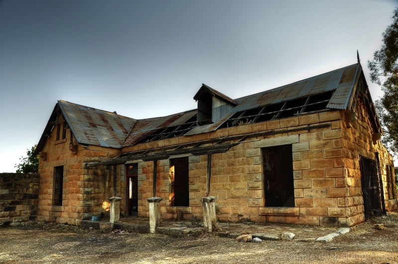
Never read the book, but I do understand that there was a dark and ugly place in the book. Maybe a human element would have made this have more appeal. Maybe some adjustments would have made some things stand out a little more. I know it is the angle, but on the right side of the image, the house looks to be leaning a lot. Maybe find a way to crop it out or recompose the image.
I like the light and the details, perhaps the composition is unbalances by the tree, or not enough of it. The major color tones are spot on, and the glow of the sky behind the building is not overly off-putting.
A very clean picture of a house that has some charm though. Or let's say some potential! I never imagined the one in the novel like this; this one strikes me as very American and I don't see the gnarled branches that were so important in the novel.
The hues are lovely
6
Hmm... Sorta on-key - but sorta not, really doesn't evoke the Wuthering Heights of the novel, but is at least similar enough to give you a pass on that aspect.
What isn't present here is that sense of foreboding, of mystery and darkness.
4...I get nothing of Wuthering Heights from this at all. Some breathing space around the building, and perhaps a different angle may have been more interesting. I feel like I want to see more of the landscape around this building to see if it can tell me more of a story.
I could see a ghost attachment to this place. Technically sound, but difficult to make spooky with the stronger light. The transition from sky to house seems to have a glow that I think detracts. 6
I think of Wuthering Heights as a moldering old mansion; so this doesn't quite fit. However, the stonework is nicely detailed, the color is natural except for the sky, and the composition is good and tight the way I like it. Overall for the topic: 5
I don't know the book so I'm glad you've pointed me a little further along in your title. The building is decayed, though not ugly. It might be dark but you're not really conveying that. It comes across to me as a fairly straightforward documentation of the building, with no interest as an image. Whatever is happening with sunlight and weather, you seem to be minimizing instead of showing... and really a photograph is essentially the document of a moment, not a thing. 2
It is ugly as it stands, shame really, but not a lot going on here for commenting I'm afraid. I see the relationship of the burnt out building with the storyline and somewhat the time period.5.
A dark and ugly place indeed! Very nicely tonemapped, a little close to the edge though (some halo-ing around the roof). Wish it was a little darker though, perhaps in B&W to emphasize the state of dereliction the structure is in. The bright, cheerful processing almost seems at odds with the actual state of it!
Amanda volgens my is dit joune die. Ek herken die boustyl as tipies plattelands Afrikaans en volgens my het ek die gebouw ook al eerder in van jou foto's raak geloop :) Baie mooi. Julle moet die plek renoveer, dis dan so 'n mooi kliphuis.





 Add photograph to your favorites
 Add photographer to your favorites

 Photographer found comment helpful.