simple and to the point
i've come back to this image a few times but they're never open, so i guess i can't comment on the authenticity to a curio shop.
a 6 from me
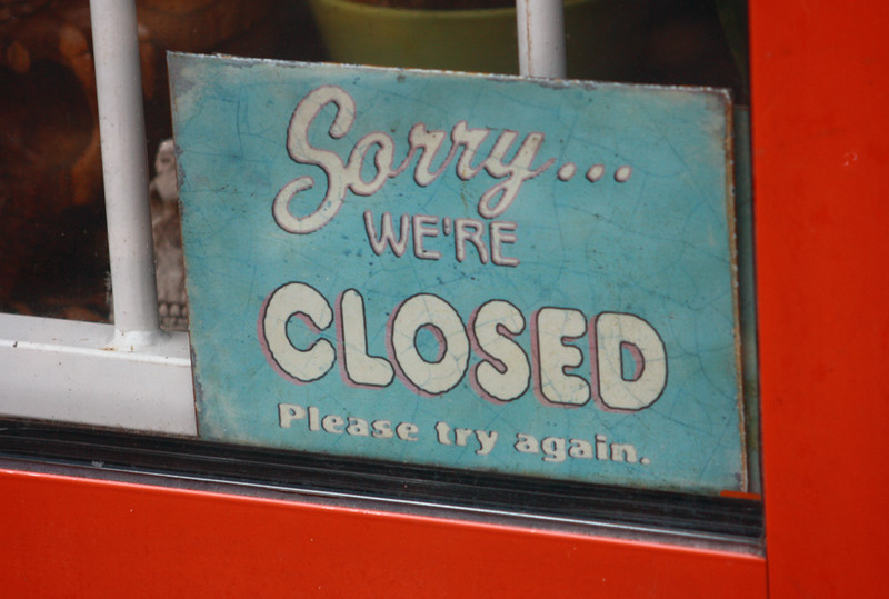
I think the redeeming thing about this photo is the skull; its a decent theme, but not very sharp, colors a bit flat, a full frontal crop, but then, you see the skull. that saves it.
Technically I don't much care for this; the framing is awkward, the light is kind of blah, it's just so matter-of-fact. But the Old Curiosity Shop was a magical place, layer upon layers of remarkable things. So this is just a disconnect for me.
The photo hasn't much merit on its own, but I do like the confrontational attitude has in the context of this challenge. I haven't read the book, and apparently, you're not going to let me! 5
Cute quip on the topic. But except for a smile, the image has not much more to offer. Purely on technical grounds, it is a competent quick, unprocessed take. 3
This seems like a loose tie to the book, though I have only read the plot summary so take this with a grain of salt. Not a bad shot, but I don't get the feeling that it emotes much of the story. 5
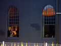
3...no. This is lazy. At least show me what's in the darn window. ETA, I wanted to add to my original gut reaction. I'm still giving this a 3 and here's why...it's just visually unappealing to me.The composition is lazy/flat/boring. Show the viewer the curiosity shop, not just the sign. And to be perfectly honest, beautiful light, of which there is none here, can make the most boring things come to life...even to Sorry We're Closed signs living in bad compositions.
This image lacks any real substance to it in my opinion. I have never read the book, so maybe I am missing the point, but there isn't much to look at or think about.
good find that could have been exploited better with a different angle. It looks like it was taking in a rush. I would have also tried to ge tin the frame the crane that looked old and curios. 5
The way that you've angled and how the sign takes up the majority of the window space makes me wonder what's in there. So the title fits the image well, or the other way around. Whatever.
Anyways.
I like the contrast of the red and blue as well.
Nice shot.
Gave it a 6
Quirky little image! And quite appropriate for the book title! The glimpse of the skull behind the sign makes it all the more curious! What is this store? What does it sell?
That was an easy joke but what would I do with this shot outside this challenge.
I always ask myself when I see a photograph of the aesthetic or intellectual aspect of it, or the power of a stimulant for the mind
4





 Add photograph to your favorites
 Add photographer to your favorites


 Photographer found comment helpful.


