bit of a shoehorn, i must admit... i have a big thing about working with girls who are not traditional models by any means... and i only do very very minimal post editing (acne goes, thats about it)
Statistics
Place: 85 out of 86 Avg (all users): 4.1981 Avg (commenters): 4.7727 Avg (participants): 4.4318 Avg (non-participants): 4.0323 Views since voting: 3228 Views during voting: 350 Votes: 106 Comments: 22 Favorites: 0
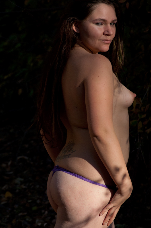
I don't find this image interesting at all. The lighting seems really bad to me. If you want to accent parts of the body, the lighting needs to be placed strategically. It seems that you just used what was available. The shadows really do a disservice to the overall image.
If you wanted to go for title...which you obviously did, maybe you should have had your subject bent over with her "fanny" in the air making a "hill". This would have made more sense than just having a naked woman in a photo.
4...oh that purple thong strap. This would have been a hundred times better without it. It would have flattered your model so much more. Her hair is also blending into the background a bit too much giving this strange effect of her being bald. Dappled light is tough to shoot in. Reflectors can sometimes help fill in those shadow areas.
the look on the face just isn't working for me, it seems forced, while this type of pose should seem natural. it's the eyes mostly, they should be looking directly into lens to make a connection with the viewer, but here they are seemingly looking over my shoulder
a 6 from me
Your take on this erotic novel is less daring than an Édouard-Henri Avril for instance; it's a well taken picture where the shadows make it more interesting.
I would crop a little from the top of the head and right of the image for more concision
6
This isn't working for me at all. Chalk it up to latent prudery if you want, but I find the image profoundly unappealing. The expression, especially, is quite disturbing. I suppose the image meets the challenge, in the sense that the book's about a prostitute and it's quite bawdy, but for me "bawdy" inspires a sense of rough-and-tumble fun (the book displays a tremendous amount of risque humor), and this doesn't incorporate that element.
Regardless, the image is not technically especially well done, either in lighting or in pose, IMO. I'll give it a 5, which is what I give any image in this challenge that seems to me to MEET the challenge.
Yes quite a "classic" as I remember. This certainly suggests the raw sexuality of the book, but I think the thong is an anachronism. Better wearing nothing at all if a period piece of undress isn't available. Also I think the book was an indoor setting, so the leafy shadows don't fit either. But enough nitpicking. The challenge was to draw inspiration, and that you've done. Clearly, in a most elemental way. 5 for a lovely breast.
this is indeed appropriate to the book. I like the look she's giving DPC. It says "Screw you!" There's not much to commend this as an image, but at least it has a message with some oomph, so I'll give you a 6.
I am not familiar with the novel, but if it was about the story of a woman in a sexually oriented literature, then the image doesn't do it justice.
Lighting is harsh and doesn't suit the mood of the image. The exposure and focus on the face seem to be a bit off, and the background is too messy and distracting.
Very bold entry. The lighting is a bit off. The spot on the hip distracts a bit. Maybe the circumstances did not allow but I would have played more with the poses and the light. 6
Not sure what to say really. Although I'm sure that probably won't be the case with some other more vocal voters! Composition is lacking, more seductive posing required.
Sure does have that alluring look. This one raises a lot more issues than what I would perceive as the first reading of the novel. Lighting is a bit uneven, the models stance and wardrobe does support the theme, and her gaze is spot on.5.
The lighting seems off... I'm not feeling the angle chosen... and the skin looks like it would have benefited from a softer and warmer processing.
Gave it a 4
Somewhat appropriate tie to the book, though would have preferred a more time appropriate look. The clothing and tattoo detract because of this. The lighting seems to try to draw my attention to the hip. 3






 Add photograph to your favorites
 Add photographer to your favorites


 Photographer found comment helpful.


