Thanks everyone for the comments.
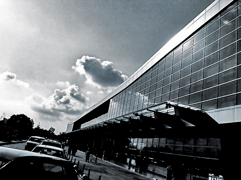
I processed this shot so as to give it an inky/sketchy feel. because that's the kind of illustrations we find in classic novels, rather than an extremely sharp crystal clear dSLR photograph.
Intentionally darkened the shadows to hide too much detail from being visible.
This was processed to make it a "love-it" or "hate-it" shot. Although I love it, voters have mostly hated it :)
I don't know the book but this certainly evokes the title. I quite like the big area of nothingness in the upper left and how you even tilted the horizon to get this phenomenon. Is this some sort of worship of the great invisible aboveness? It is certainly the primary light source of the image, a light source that your processing emphasizes to stunning effect. 8
I'm bumping this to 10 and putting it in my art gallery. To continue the exposition, I hang things in my gallery if I feel they are independent works of art. For example, I could publish this in a literary magazine and it would fit right in.
Googled it ... sounds interesting. May have to check it out. The photo appears to match the theme of the story, so kudos on that! :-) May be slightly over-processed (heavy dose of noise reduction?).
4...it just doesn't hold my interest. I have a hard time getting past what I see as some technical issues, like the blotchy-ness in the sky and the complete loss of detail in much of the shadow areas.
Hmm. Might fit. Might not. I suppose I can worry about that less as the image itself is more than sufficiently deficient to merit no extraordinary attempts to understand it.
The image has a noise in the sky that is hard to describe, but I'd call it "large blotchy noise" and the image has otherwise been denoised to the consistency of melted plastic. Shadows here are massively too deep, and the slightly tilted composition does nothing for me.
Comment Challenge: Interesting building and posts between the road and the walkway. The image, however, seems to be overprocessed, with too much overexposure on the left, and too little exposure in the bottom right. I like the clouds, and the sun's reflection in the windows. I'm not sure what the tilted perspective gives you.
I don't know anything about the book you are referring to but I believe that you showed it like it is: city of glass turning wrong. Does not seem to have a happy ending.
I like the tonality but the picture is a bit confusing, a little too inky in the shadows.
5
I like the composition of the photo. I don't get city of glass out of this shot though. Looks like an architecture photo and that architecture has some windows in it.
interesting perspective and tonal choice. i can see a vision of something grand here, a concept being pitched for "the city of tomorrow, today" or something of that sort.
i like it, but at the same time it leaves me wanting more, which is good and bad because it certainly means you've succeeded in drawing me.
a 7 from me.
There are apparently several of these books, none of which I've read and mostly new. Not sure if I'm missing something there. I like the mood of this shot, but there are some aberrations that keep me from loving it. There is some over-sharpness particularly on the windows and cars, and some over smoothing on the sidewalks and clouds. Neither would be that bad by themselves in the context of this image, but combined they clash. 5
It's a real stretch to call this a "classic" novel and although the very harsh processing does add a brittle quality (as of glass in a fantasy world), in the end the extreme processing becomes too overpowering and the digital artifacts dominate the impact, especially in the mottled sky and the black mush of the shadows. 5
I haven't read the book, but I think that it's meant to be set in New York, so I'd expect high rise glass buildings. I do like the mood though. I would have expected to see a hint of the character in the photograph. A 4 from me.
Nice urban landscape and choice of blue tint. Always feel it works well with buildings! Compositionally I find this lacking a little with all the distracting elements. Maybe some skyscrapers with a nice dramatic sky would've had more effect/impact?
I'm not feeling this shot. Seems out of focus, no real subject. My eyes go from the cars, to the clouds to the building to the people. I guess with that title, it would somewhat fit... but I'm not feeling it. Gave it a 4





 Add photograph to your favorites
 Add photographer to your favorites


 Photographer found comment helpful.