Initial Reaction: Windmill...
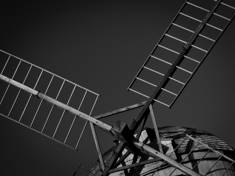
Suitability for Challenge Topic: Tilting at windmills.. Hmm... Figurative, but directly related to the text.
Aesthetic: A little bit low contrast, and a touch soft. Tilted composition works here, and not just because of "tilting at windmills"..
Needs Work: Exposure/contrast
Final Thoughts: While this doesn't really tell me a story, it is at least applicable.
Score: 6
Windmills? Check! Tilting? Check! Of course, when they talk about Don Q "tilting at windmills" they are describing him attacking with a lance, as in "jousting", but what the heck. I'm amused.
Photographically, sort of "meh" but still intriguing in a matter-of-fact way.
Probably need a bit more in the composition to push it into a larger interpretation of the novel. I like the mono, but it is a little flat in the lighting. It has an old world feel and I like the angle you have chosen.5.
Windmills in his mind. I like the point of view here as seen by the knight - a target for his lance. Technically, it's a little dull - some processing to bring out contrast and details would help. I give it a 7 for content, a 6 for composition and a 5 for technique. Result: 6
I have not read the book, but I've seen enough pictures to know the windmill is a tie in. Image wise, I like the framing of this shot and the staggered greys. Well composed. 7
The connection between Don Quixote and windmills is obvious, so you can be neither punished nor rewarded for it. The composition is close-up with the paddles going out of frame, which is good, but I'm not a fan of the orb in lower right... I don't think anything is counterbalancing it. It "grounds" your image too much. 4
It does depict the windmill but it lacks the fight. It also appears to be a replica and looses authenticity. The composition is fine but the whites are to dim hence lacking contrast. 4
The tilted angle of the top of the windmill(?) is a little odd... I would have liked to had seen a more "straightened" shot... and it's a lot of "grays" rather than black and white. But theres good clarity. I gave it a 4
Interesting composition and perspective! It works, I like it. Lighting seems a little flat though, wish there was more dynamic range though...some more prominent highlights as it's coming off a little flat for me.






 Add photograph to your favorites
 Add photographer to your favorites


 Photographer found comment helpful.


