John Steinbeck's classic novel of the suffering that the drought brought with it, and man's inhumanity to man. A great read, if grim.
Originally I wanted to do William Golding's Lord of the Flies' pig's head on a stake, but due to difficulty getting a pig's head in time, had to rethink. I had some other ideas in mind but I can foresee them being quite popular.
So I was outside, rethinking, when I noticed that my pine tree had these odd black thingies hanging from it... to my surprise and delight, a grapevine had entwined itself around the outermost lower limbs of the pine and now there are small clusters of wild grapes hanging off the tree!
They seem to be Riverbank grapes, possibly aka Mustang grapes. They look like small Concord grapes, and smell like someone poured a jug of Welch's grape juice on the ground. Not the best to eat as they are quite tart - most of the flavour is in the skins than the pulp, with large seeds relative to their size, but I found a recipe for wild grape jelly.
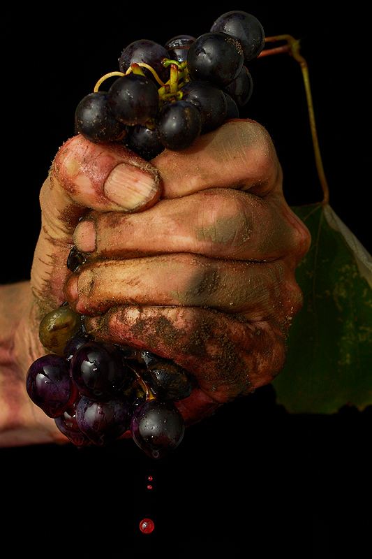
Anyhow, now that I had ready access to some handy props, it wasn't long before Grapes of Wrath came to mind.
Found some loose dirt outside, rolled it around in and on hands, then washed the dirt off to some extent, knowing what was left would soon dry as a nice light mud layer :-) Made fake blood from simple syrup (1 cup white sugar, 2 cups water) and red food colouring. Dipped the bottom most grapes in the blood so it would drip convincingly.
Shot in studio with SB-910 and 50mm up. Tried to do it as a blackfield shot but didn't work; tried to snood my dumb slave to illuminate the drips more convincingly, but it was erratic at best.
pp: shot jpg, crop, brightness/contrast, minor cloning, dodge and burn, resize, sharpen, save for web
_______________________________________
Post-challenge: 7th place for the D7100...hope it doesn't become a pattern, I really want to ribbon and/or 7+ score with the 50mm.
Well, can't say I'm too disappointed with a TT finish, esp as this is only the 2nd challenge shot with the new kid. I plan to submit this to Alamy and see if it makes me some $$.
Re the *crooked* drops...I was gently giving the grapes a little shake to help dislodge more of the juice/blood drops, hence the angle. Had I tried to straighten it so the drops went straight down, the wrist would have appeared to be even more crooked!
Statistics
Place: 7 out of 86 Avg (all users): 6.6727 Avg (commenters): 6.4545 Avg (participants): 6.4651 Avg (non-participants): 6.8060 Views since voting: 1397 Views during voting: 220 Votes: 110 Comments: 31 Favorites: 0
WD Susan. Great image and live I love the backstory. The only Top Ten image actually done in a Portrait Orientation that is usable for a Novel Cover where any edit would harm the overall composition or feel. No one appeared to pick up on this small overlooked criterion in this challenge. Novels/Paperbacks are taller than wider!
One of my favorite books ever, and the movie is a classic too. Though a literal interpretation, I find this image compelling. I feel that courtroom in this grasp. Excellent.
Whilst I don't feel that the image has necessarily much to do with the book, I really like it! The dirty hand, the nails, the grapes and the lighting are great. Best of all for me are the grape juice droplets which could be interpreted as blood, pain etc. It tells a story of its own. A 7 from me.
Very well composed and executed image. I don't think it has much to do with the story though, and that is really what I was looking for. In another challenge I would have marked it higher. 6
Initially I gave this photograph a 6.
But then when I came back to comment, I saw other things that draw me in... like the drops of juice coming from the grapes. The detail of the dirtiness of the hand. The shot is really good and more deserving than a 6, so I'm bumping to an 8
Symbolically there, though the novel deals with drought, the feeling of anger and angst is clear and the grittiness of despair. A tough one to portray I must admit.5.
A technically sharp photo combined with a clumsy, obvious idea is particularly unattractive. There is no charm to clumsiness when it is done so professionally. 2
Very nicely done. It doesn't have that much to do with the novel, but I could still see it as a symbolic cover. One thing bothers me a tad -- it looks like the image is tilted... the drops aren't falling straight down, they're falling at an angle. It doesn't look quite right.






 Add photograph to your favorites
 Add photographer to your favorites


 Photographer found comment helpful.


