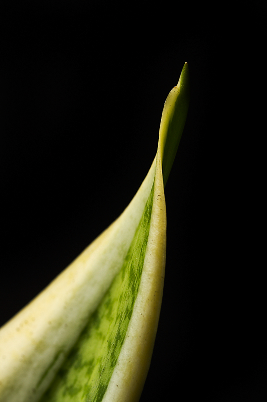
Ok -- it took forever to read the summary, but now I get the reference. Not sure about the composition, though. I like the shape, but the DOF is giving me a bit of a problem, just because such a main part of it is OOF, and that's the part my eye goes to first. I'd actually be curious to see what this would look like the other way around -- the tip closer in, and the leaf going out. I know it's not the idea, but the DOF might work a bit better? -6-
I have read Orwell, of course, but not this. My search came up with this quote “Mrs Weaver nosed among the books, too dim-witted to grasp that they were in alphabetical order.” and it seems to fit this image well. Continuing, I discovered that "the aspidistra is the tree of life” and it hit me.This image is so interesting.. the ins and outs of life and the struggle to get it right. Excellent work here.
Comment Challenge: Nice colors & contrast against the black background. The larger part of the plant (on the left) is the part that is OOF. For me, the shallow DOF detracts from the image, rather than adds to it. The patterns in the green are interesting, and the curve of the leaf edge add interest.
Heh... Quite literal, but in the case of this book, it rather works, as the aspidistra in the book serves as a metaphor for acceptance of what life brings.
I can't give huge points, partially because I don't find the image SUPER attractive (although, admittedly, it is pretty good), and because I fail to really get as much out of this as I would hope, perhaps if there was more context..
This certainly gives the impression of the named plant, but i find the DoF slightly too shallow. i'd love to have a bit more focus going back, and i realize that is hard to do while maintaining the focus throughout the top areas.
Still a 6 from me.
I can't really comment on the connection with the novel as I'm not familiar with it. I do see a connection with the Aspidistra plant though. As far as the image it is something that I like. Such as the black background, good lighting and effective use of a shallow depth of field. 6
I think the aspidistra alone is too literal to serve as a visual extension of the novel although in the image, it does have the thrust of motion upward and away and so appears to reflect the title. The strictly photographic qualities do not make it stand out beyond a simple plant macro however, so it is difficult to consider better than an average vote. 5
I like the subject popping out of the pure black background. The black space actually adds an area where you could put in an imaginary text title, and you'll have a cover image for the novel. 6 from me.
Ok, so the plant is an aspidistra, but other than that, I don't see the relationship with the book other than the one word in the title.
For the pic:
It would have been a good play on words had the plant been suspended in air or something. I would have liked to have seen more detail in the greener areas as well. Maybe a thinner angle for the bottom of the leaf too.
Seems like a good composition only a bit too much of the subject in the foreground which to me seems to hold the movement inspired. Lovely contrast and exposure, nicely isolated form the black background. 6






 Add photograph to your favorites
 Add photographer to your favorites


 Photographer found comment helpful.


