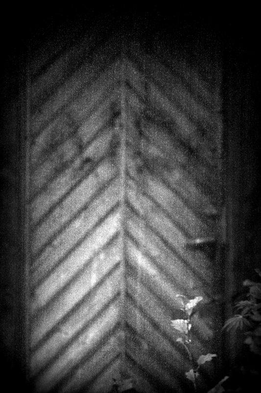
I read the story plot, and I just don't see the connection to the story. I don't think the grain does anything to improve the image...maybe it gives the WWII newspaper feel or something. Just not an appealing image to me.
This book is about memory, and how that makes us all time travelers. Your image feels like a memory. Also implied is that this is a door to a slaughterhouse. So this memory-door leads to death. Chilling. 8
Yeah, this looks mean, ominous, downright trickery, a cannibalistic witch living deep in the forest in a house constructed of cake and confectionery in mono. Schlachthof-fünf never looked better.8.
The tones and grain give it a sense of foreboding that I like. The slight disassociated feel of the plant works well. This is one of the Vonnegut books that I haven't read, and reading the plot summary doesn't give me enough to make a tie to the story. 7
To me this relates well to the bleakness of the novel and I like it even if not. The banding adds a primatively futuristic (or defective high-tech) effect. 6
I want to like this from a creativity viewpoint, but I just don't see the connection to the Book title. Is that my fault or yours? I'll reserve voting while I ponder this some more.





 Add photograph to your favorites
 Add photographer to your favorites


 Photographer found comment helpful.


