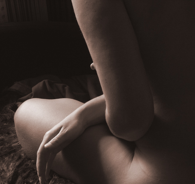
That's a nipple, right? You need to show a bit of the breast as well. The lighting and angle make this look like she has a very large skin tab or mole on her arm. The rest of the composition is lovely, and I like the tonal range. We just need to see a bit more or a bit less breast.
Except for the nipple (or whatever it is) sticking out from behind the arm, I like the picture. Additionally, if I may nitpick, there are only one hand and quite a large part of the whole body in sight whereas the title is "Hands".
Very nice tone and a wonderful pose but since you named it hands, I would have hid the nipple because it rather then the hands dominate. Of course, one can argue that we are talking parts, part of the torso, part of the thigh, part of the arms etc. And while it may be a tongie in cheek, the poiny may be missed.
I think boith hands would have been better. The top of the dark area shows something in the background which is distracting. The tone is nice and warm but for me it lacks a "story" or a point of particular interest. The hand is the perhaps the most interesting part and it is leading the eye out of the shot. Just my opinion anyway.





 Add photograph to your favorites
 Add photographer to your favorites

 Photographer found comment helpful.


