I am sad that at this size at least your processing and/or time lapse makes this look like one of a zillion such shots. I am not a colour expert but I feel almost claustrophobic from the lack of colour nuance. 4
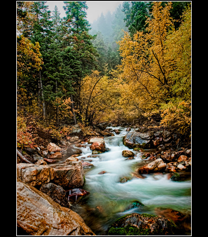
I really like the colours, the milky river and the disappearing trees in the background, not sure about the processing (just too much?) and the border.
looks like a painting
good use of long (or multiple) exposure here in the water. i personally would perfer less on top of the image and bring the river up more in the frame
an 8 from me
For someone who doesn't like over saturation, this one has my attention, even if it leans to the left ;) It's a great composition and quite a vibrant and wild scene, what I imagine the novel is like (with my little knowledge of it).6.
Hmm. This registers about a 20% on the "Meets challenge" criterion.
The image itself is really quite good, maybe a tad overdone, but really beautiful..
A fly fisherman in waders here would have compelled me to give you a score of 8+, but as it is, I'm left with a desire for what this could have been, rather than a love for what it is.
6...this is quite nice and fits the book. I can't stand the border. I'm not anti-border, just anti this border. That little white border is really fighting the image for attention, and it's winning. And the way the black in almost nonexistent at the top and bottom...I don't know why or for what purpose. A simple black border would have been perfect.
Reminds me of the Smoky Mountains...one of my favorite vacation spots.
I like the longer shutter speed for the river. I like the saturation of the colors. The one thing that keeps me from scoring it higher is that the left side of the middle seems busy and cluttered. It kind of pulls my attention away from the good stuff.
The image works well - good color and processing for an illustrative picture. But in all my years of art school and since, I've never seen, nor can I understand the purpose of this particular border, which becomes a serious distraction for me. without it, the shot is a 7. With the border, it is a 6.
Really like the colors and feel. The mist in the trees and the fog feel to the water mixed with the bright yellows and greens feel like out of the story. The major element of the story is fly fishing though and this only has a loose connection there. If this were another challenge I would have bumped it one maybe. 7
A very beautiful photograph! The title fits perfectly. The colors are nice and warm. But I feel like theres just something missing. I can't quite put my finger on it.
Originally I gave it a 6, but bumping to a 7
Nothing much to say here as it doesn't inspire deeper thoughts in me, but this is a very nice image that fits the title and the book very well. I'm a little less than satisfied with the actual *quality* of the image: it seems to lack sharpness at a critical level, though of course it's hard to say why at 800 pixels, but in any case it's not a serious flaw.
The white inline on the border, on the other hand, is kind of overpowering. It would work better if it were less white and not as thick, but I don't generally score down for borders.
A little too much Topaz or whatever you used to sharpen your shot--still a great photo, but I'm just distracted by the PP and the black borders on the sides. 6
A beautiful scene, and most appropriate for the chosen book! Love colors and saturation, and I love the motion blur. I am not a big fan of the excessive border and what looks to be tonemapping, though. Still Top 10 for me.





 Add photograph to your favorites
 Add photographer to your favorites

 Photographer found comment helpful.


