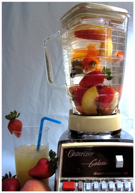
Just a note- I've had these guys for a while and love them! I would never hurt them, the blender isn't plugged in, and they were ctually in there for only a minute. Plus, they kept eating the fruit... I think they liked it!
This was hard to set up, I wish the lighting was a bit better. Maybe if I had had a little more time... I really did take this too quickly. Planning a reshoot in the future. If only spot editing were allowed in contests :)
I think it was the look on his face that made it work so well.
Thanks so much to everyone who rated it so high! I am truly honored that it was so well-accepted for its creativity!
Statistics
Place: 4 out of 154 Avg (all users): 6.6190 Avg (commenters): 7.0750 Avg (participants): 6.5250 Avg (non-participants): 6.6542 Views since voting: 4085 Views during voting: 499 Votes: 294 Comments: 50 Favorites: 6 (view)
I didn't submit to this challenge so I didn't vote. This is the best! As you said, the expression on that little guys face is priceless!! Top notch work done here!!
Hilarious- especially with the expression on the fish. One of my top 5 picks in this group. The blender contents are perfectly exposed, but the hotspot on the right side and dull exposure on the left are distracting.
Less is more. I think you just needed to include the blender jar with the contents to make this statement. Your sheet in the background should be ironed or purposefully folded and wrinkled to break up the background. The light is hot, but you did well in trying to backlight the jar so as to minimize the reflection. - 6
PETA to the rescue!!!!! Great expression on the fish, kinda says "Oh #%#!" My only complaint would be the composition. I think undue attention is drawn to the glass with the strawberry and the blue straw. Also, this glass is in shadow. Unfortunately, my eye is consistently drawn to the lower left corner, when the part of the picture that shines the most is on the other side of the photo. Great effort.
Great idea! A shallow DOF would help to blur the background. It would have helped to have another method to light the background. Still good though but could have been much better.
the background and lighting aren't so hot, but the idea is fun... would've been better had you only shot the blender on a dark background,...but good effort!
This was an excellent idea with problems in execution. The background is the downfall. The wrinkled sheet is terrible. I would have considered a black background and direct backlight as the main light source. Very creative though.
This one made me a bit uncomfortable.... Although I must admit, it's a great concept.... Rethink the condition of the backdrop... Too many creases and wrinkles.
ginette
yep, wacky, the goldfish look to be in panic. Pity about the background, next time iron out the wrinkles, or take a different material, put it out of focus, or overexpose so it becomes totally white.
This was one of my favorites. The DOF could have been a little shallower. The creases in the cloth behind the subject are kind of distracting and the right side of the image seems to be a bit overexposed.





 Add photograph to your favorites
 Add photographer to your favorites

 Photographer found comment helpful.


