Author Thread
Post actions
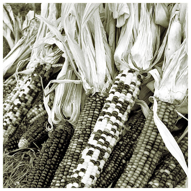
Lovely range of tones. Black and white works well for this image.
Post actions
Oh people, why its so low???
Comments Made During the Challenge
Post actions
Great shot of a staple of fall. I like the repetition of the corn & the angle you chose to place them at.
Post actions
One of my top 10 of this challenge, great composition
Post actions
Post actions
I love all the texture....there's lots of contrast but still a lot of detail. I like the way the 'white' bits of the front corn are a bit blown out...7
Post actions
I think you made an excellent choice to go duotone with this shot. It looks great and the contrast came out really well, despite some of the lighter kernels blowing out just a bit. This is a really nice shot - one of my favorites in the challenge.
Post actions
Good shot. I'd really like to see this one in color though, as that's the main attraction for this type of corn. I'd also crop about 20% off the top of the image to focus more on the corn itself.
Post actions
This photograph cries out to be in color.
Post actions
i like the different tones - however you face the same problem as I do - how to get the impact.
Post actions
I like the sharp and complex details in the whole image, and the color scheme adds a unique old-time feel. The husks add a lot to this image, I think, too.
Post actions
This is a great picture for the fall season... I like it even though it may not fit my personal idea of a wacky food. Nice composition
Post actions
Good idea with BW... such nice contrast...
Post actions
If ever there was a picture that did NOT want to be presented in B&W this was it.
Post actions
Indian corn in b&w?
Post actions
Great in b&w. I really like this photograph. Well done.
Post actions
but why B&W if the different colors are so important ? Still a good image though, I love the tight crop.
Post actions
Nice contrast and composition. Good job.
Post actions
Great composition. I really like the randomness of of the way things are laid out. IMO - seems a little overexposed on the center cob - lower kernels seem blown out. Nicely done.
Post actions
Very nice... I only wish that you had pulled in a little closer to some of the corn and the stalks...
Post actions
I think this would have done better as a color shot.
Post actions
Great picture. I would have trusted the colors since they are usually quite brilliant.
Post actions
Maybe color would have been better. Nice shot though.
Post actions
I would have framed this picture lower in order to see the whole corn and less of the stalk
Post actions
Nice composition, good coloring.
Post actions
Doing this is sepia tone really works well. It emphasizes the shapes and textures rather than the colors. This is one of my favorites in this challenge.







 Add photograph to your favorites
 Add photographer to your favorites

 Photographer found comment helpful.


