best I could do for this one......just couldn't get the lighting right...PLEASE comment if you have any advise..thx
Nikon D70
2004/09/28 22:08:49.9
RAW (12-bit) Lossless
Image Size: Large (3008 x 2000)
Lens: 50mm F/1.8 D
Focal Length: 50mm
Exposure Mode: Aperture Priority
Metering Mode: Multi-Pattern
1/60 sec - F/22
Exposure Comp.: 0 EV
Sensitivity: ISO 200
Optimize Image: Sharp
White Balance: Auto
AF Mode: AF-S
Flash Sync Mode: Front Curtain
Auto Flash Mode: Built-in TTL
Auto Flash Comp: 0 EV
Color Mode: Mode Ia (sRGB)
Tone Comp: Auto
Hue Adjustment: 0°
Saturation: Normal
Sharpening: High
Image Comment:
Noise Reduction: OFF
Statistics
Place: 68 out of 154 Avg (all users): 5.1582 Avg (commenters): 5.7917 Avg (participants): 4.8765 Avg (non-participants): 5.2639 Views since voting: 10629 Views during voting: 432 Votes: 297 Comments: 26 Favorites: 0
Just finished on your complexity entry, pushed the button and got this one to critique… Guess that doesn’t happen much.
I’ve read in your profile that you want to score 8+ photo’s at least 3 ribbons within 3 months and a 6+ overall score, so to achieve that I am not going to be nice, but realy point out why you didn’t win (in my opinion) instead of being nice and say that your photo is not so bad.
Your photo isn’t so bad, but it’s far from a ribbon, and if that’s what you want… well…. Hold on for the negative comments that follw :-)
I also commented on this one in the challenge.
OK, so now I am going to try to help you here to win the next challenge (not the free study, I’m going to win that)
Let’s take the Handburger (same idea) as a point of reference and see how you could improve…
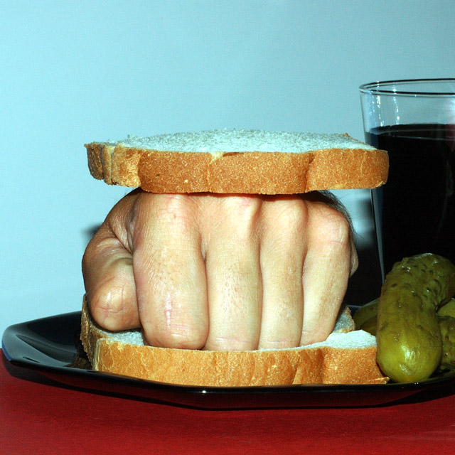
As you have seen from the comments your photo is a bit blue-ish , there is a simple way to overcome this problem.
Here is a simple but effective tutorial how to do this in Photoshop.
//www.idigitalemotion.com/tutorials/guest/colorfix/colorfix.html Your composition is also not really flattering, it’s funny but not really convincing. You filled the entire frame leaving you with an almost centered composition. Try to make use of the rule of thirds:
//www.aea1.k12.ia.us/lois/ruleofthirds.html And as you can see people here at DPC really like negative space, so there’s nothing wrong with using that.
Furthermore the hand is a bit washed out and has some ugly highlights (from the flash?) the glass and the plate also have some nasty reflections.
Just go to buy some 1000watt work lights (2 of them or so) and experiment with lighting. The reflections on the glass and plate could been taken care of with a polarizer…..
Well that’s all I have to say for now, hope you are not to mad at me….
Keep up the good work.
If you have any questions, comments or other things about this critique, or are bored and want to spam someone just PM me.
returning for comments.
The kind of picture that can get you in trouble but the effect is nice. It is a shot that needs colot correction. You have my 6 for bravery.
The scar on that finger makes it look like this sandwich has been served before :)
This is an idea that had to be done. The deep red foreground and the light blue background clash in my head, I would have preferred them to be the same (and using the darker color to hide the shadows somewhat).





 Add photograph to your favorites
 Add photographer to your favorites

 Photographer found comment helpful.


