I'm very surprised this image ended in the bottom ten.
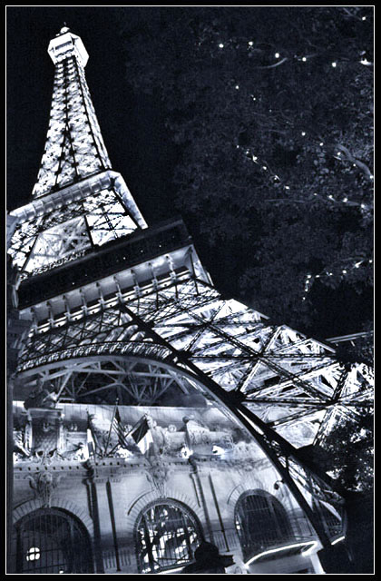
I guess this wonderfull photo was voted down because a lot of the voters didn't realize their actual is a copy of the Eifel-tower in Vegas and therefor believed this was a photoshopped image.
Great shot, dazzling and phallic! you have the eye and this would make a great poster. This holds up well against all the other masters shots, its clean, well composed and interesting.
This is very unusual shot, the stile is impressive but I'm not sure that it is making the shot better. And the light dots in the tree are very distracting.
A very interesting composition and rendering of the b&w. The titled horizon works well for this. I'm not fond of the border technique and wonder if you really need the lighted trees on the right.
I think there are loads of things to look at in this shot, kind of muddles me up to begin with. The tree on the RHS is a bit distracting, looks as if it shouldn't be there. 7
I like the angle of view and coloring of this image. Some parts look to loose some detail as result of overexposure, especially towards the top of the tower.
Well good thing I love funky angles and purposefully crooked shots. This is a nice composition! I like the contrast of tree lights to big bright parisan lights. I have got to get to Vegas, jeez. I personally would've cropped the bottom more, as I've spent so much time wondering if that's a person and a car...or what...I can't quite tell...anyway, just a minor distraction. I really like this! Thanks!
Very intersting perspective, i like it a lot. Black and white works well. Maybe a tad more contrast and i would burn out the highlights of the tree on the right. Just a suggestion.8
interesting angle. I feel it needs more contrast, the whites and blacks kind of run together. This also might be from underexposed dark areas causing grain. Nice shot none the less. 6
A very well thought out angle to shoot from. When your shooting such a popular subject it makes it hard to create something that stands out.
However, there isn't much of a focal point here - the top is very nice nd takes your eye, but to me the bottom is just a little bit too messy with what looks like a person, a building, a bush and the bottom of the tower.
nice photo! though i would have liked to see the tower by itself without the addition of the "las vegas" though the effect is interesting i would have prefered to see it removed.... though this is just a personal preference and has nothing technical to do with the photo congratulations though on an interesting photo to look at and hope it rates highly regardless of my personal views because after all it is a wonderful photo :) and thats undoubtable!
This is a good photo. I like the lighting in this, how the tower is alluminated as well as the tree and the structure below. I also like the angle that you shot it at, though there's some fort of bar in the bottom right hand corner that I don't really like. You should've just put the title as "Paris" and see how many people you could've fooled! 7
This is a really cool picture. Kind of abstract. I like the way the lights shine brightly, even though it's a black and white. I like the interesting composition. I'm giving it a 9.
The contrast on this is great, gives it a very gritty feel. The tree in the upper right is confusing, especially with the lights, and is a bit distracting, but helps to balance out the composition. The color cast on it is perfect.
I really like the unusual viewpoint here and the inclusion of the fairylit tree in what would be neg space works well too. This has a weird inverted feel. Very interesting. 7 (//www.dpchallenge.com/forum.php?action=read&FORUM_THREAD_ID=129433)
Oh my god! I've taken almost the EXACT same picture with my F717! Except since mine came out a tad blurry, I added some noise and it made it look very nice. But I see you used a faster ISO setting and introduced noise anyway. I think it would look a lot better with some monochromatic noise to give it an old/European feel. Hard to describe but I really liked the way mine turned out although your focusing is better than mine. I would have cropped more off the bottom as the lights on the awnings are a bit distracting. 7
I like the leading lines and angling of this image as it takes your eyes from the lower right to the upper left. Not sure why you chose B&W for this image, though, as there is not enough tonal variation in this high contrast image to be truly interesting. I think the color of the lighting would have made for more interesting contrasts. Also, the tree at the right adds nothing and I find it detracts. I think you should have cloned it out. 6





 Add photograph to your favorites
 Add photographer to your favorites

 Photographer found comment helpful.


