returning for comments
I am judging this well taken shot on very good color balance, great exposure, but not on aesthetic grounds. You got my 6 for being bold and throwing fate in the wind.
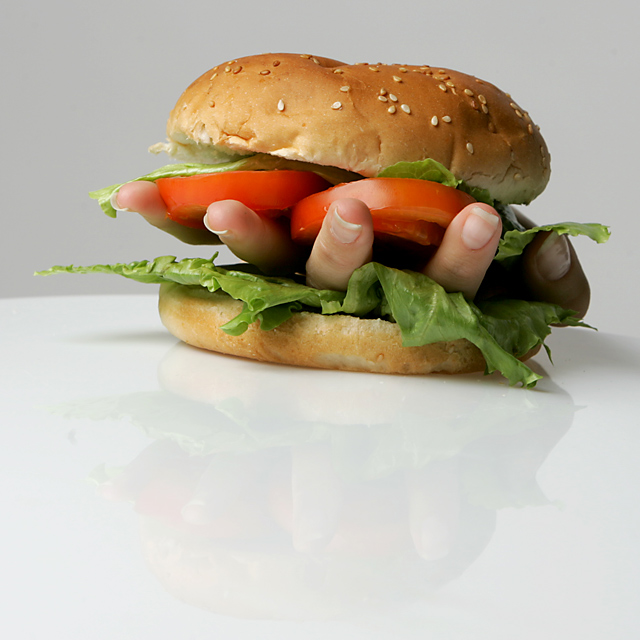
Perfect exposure on this shot. The composition is weak. I think that you've included too much space at the bottom that doesn't add to your shot. The reflection, although nice, isn't strong enough to justify its inclusion. You also have a tilt in your horizon, not enough to be 'artistic', but too much to seem on purpose. - 6
I don't care too much for the large amount of white w/reflection at the bottom, would like to see the sandwich be the entire focus of pic. Clever idea.
Okay, now that's wacky! Maybe a bit much foreground, but who cares. The concept is so good, and the photography is tack sharp. So, (well the foreground counts a little) its a 9 from me.
While the shot itself is clear and crisp and gets the "wacky" message across, I took the vote down a few notches for creativity. The gag is a bit overdone... but this pic may have promise compared to the other submissions... gave it a 6
HAHA very creative! Nicely composed although I think a little more negative space to the left might (or might not) make it feel better. Focus is sharp and colors are excellent. I do question the choice of the hand facing up vs down. In its current form, it looks like the hand is still alive and holding the tomato, lettuce and bun above it. Who wants to eat a live hand? Great job, however and an 8 from me.
This is one of the well taken shots entered and it is wacky; however the food in this shot is not wacky. Just an observation. It wont affect score. Good shot.






 Add photograph to your favorites
 Add photographer to your favorites

 Photographer found comment helpful.


