Critique Club Comments, by Grayce M. Dillon aka Gracious
Well you already know that it showed up too small here, so there is no use beating a dead horse.
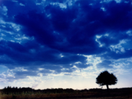
Your composition is wonderful and follows the classic rule of thirds. I love the feel of the one isolated tree,and it is silhouetted beautifully.
The sky is wonderfully dramatic...deep and forboding. Nice!
OVer all I like this. Keep up the good work.
Regards,
This picture looks very interesting, but I can't see it very well. It displays a little too small on my monitor. 640x480 format might have been better.
It's such a shame the picture is so small, I'm sure everybody else is writing the same thing! I love your sky, and the composition of the picture, so have an 8! -Annida
Your picture size is certianly not very big, but it works fine..... almost a thumbnail, with magnificent sky.......... and beautiful overall classic landscape composition... i enjoy the subdued colour of the ground, it is almost black, but not quite.
This is hurt by the small size. The picture can be up to 640 pixels on one side and the file can be up to 150k. You used 280 pixels on your largest side and a file size of 39k. This may be a great shot, but there just isn't enough of it here to tell.
you know what i saw this in thumbnail view and knew i would like it .. and now ... i don't see much more than a thumbnail .. shame .. this was going to be a 10 .. if it was in larger format for me to really see it .. then 10 it would be .. you muct have had to crop it to get what you wanted in .. and it ended up being this size. i think this could have won too if it was larger. 6
It's a bit too small, and I didn't like the blue in the clouds. As a black and white image however, I think I would like it more, as the coulds would then be very dramatic, rather than just an odd colour.
Very nice colors, but I think if the dark section at the bottom had been sharper, it would have been more effective, and if there was more of it. Also, was the small size intentional?





 Add photograph to your favorites
 Add photographer to your favorites


