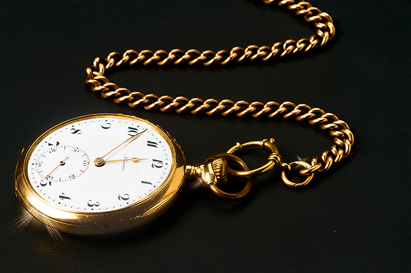
I like that the redux has some 'texture' to the ground that gives this pocketwatch a foundation to lay on whereas the original seems to be floating in negative space. There is more detail in the pocketwatch all the way up to the chain. Love the sparkles coming off the watch - a nice touch to keep because it adds zing to the composition. I think that both the original and the redux would have had a bit more visual impact had the chain come out of the right top corner. That way you would have the subject lined up on the diagonal letting the eye easy and naturally travel up and down the subject - from the beginning of the chain in the top right corner following the chains path down to the pocketwatch that is in the bottom left corner. Lastly, I think that this rendition would have even more visual impact if the watch face was oriented more towards the viewer instead of turned away- I would give the impression it is coming in our direction and also be easier to appreciate and read the details on the clock face.
I love everything here but those specular reflections. They actually kinda ruin it for me. Still gonna give you a 6 for the good technical quality of everything else.









 Add photograph to your favorites
 Add photographer to your favorites


 Photographer found comment helpful.


