As many have noted, the tones are not what they should be. I knew that - tried really hard but could not match Wendy's processing. Thanks for the kind votes and comments, anyway. I'll be getting some tutorial help after roll-over if Wendy will be so kind :)
Statistics
Place: 13 out of 41 Avg (all users): 6.2317 Avg (commenters): 7.3333 Avg (participants): 6.0000 Avg (non-participants): 6.3167 Views since voting: 761 Views during voting: 187 Votes: 82 Comments: 7 Favorites: 0
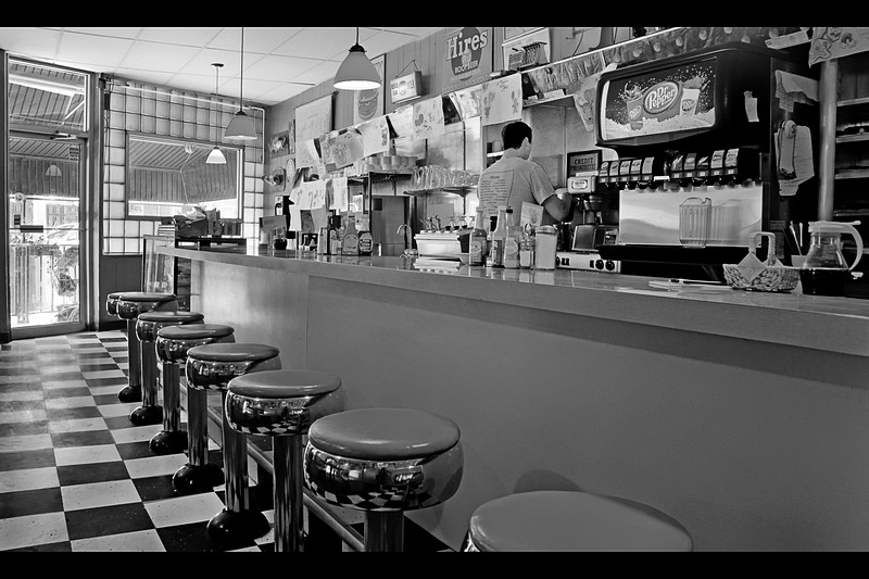
Nicely captured B&W of the classic diner. And see what you did with the title!- Now I have the theme music from Guy Fieri's show in my head :grumbles: need to find some other music to drive it out of my head. O.K. back to the photo:-) I like the angle and the B&W treatment that gives plays into the feel of 'classic oldie'. I do have two suggestions on how to improve the visual impact more. First the contrast could be a little bit more dynamic. Playing with Levels to adjust highlights/midtones/shadows can increase the contrast and give it more pop. Second, is composition. You got the right angle you just needed to move the bar stools a little more to the right so that the line come out from the bottom right corner. That way it acts as a great leading line and draws the eye to explore the rest of the diner.
This is a nice tribute to the original, a different style, less glam and pop to the processing and far less texture, but a nice composition none-the-less.







 Add photograph to your favorites
 Add photographer to your favorites


 Photographer found comment helpful.


