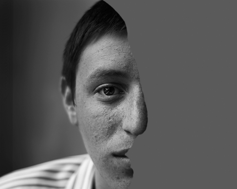
You have great detail on the man's face, nice catch-light in the visible eye, and good, dynamic B&W tones on the portrait. It is a good emulation of the original but I feel there are a few things that could have been done to make the shot better. The original had the backdrop dark and the shoulder almost non-existent. This redux could have used those two elements to help make the subject pop more visually. The white shirt and the backdrop do not allow the face(s) to shine as the main focus - they call focus away from what you want your audience to stay focused on. The face cut out while good could have been even better had the features been more pronounced and detailed like the original. Not sure that either the original or the redux benefit from the flat grey of the cut out face as maybe white or black would have more contrast pop.







 Add photograph to your favorites
 Add photographer to your favorites


 Photographer found comment helpful.


