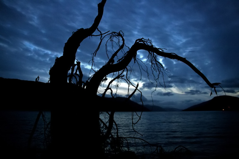
The colors and mood are vastly different in the original and redux. The redux comes off more cold and moody with the cool blue tones and moody clouds in the sky. The clouds really don't allow the tree silhouette to pop off a minimal background. The reason why that is problematic is because the clouds are taking focus away from your main subject which is the silhouette of the tree. The original is minimal in presentation showing clear distinct lines and shape of it's main subject. The tree in the redux gets lost amoung the water, clouds, and mountain. I suggest that had you taken this from a lower angle where the tree limb comes out from the bottom left corner it would eliminate the distracting elements of the water and perhaps mountains to give a cleaner and clearer silhouette that could have greater visual impact.






 Add photograph to your favorites
 Add photographer to your favorites


 Photographer found comment helpful.


