Hey, there's no shame in being in the bottom of this pack :)
I had a much better idea that I spent several hours on very early one morning, but Mother Nature refused to cooperate... so I went with this as a last minute idea. I still like the shot, and enjoyed the rather consistent recommendations, although the actual landscape of this scene makes it rather difficult to come up with the vantage point many people are suggesting.
This was a fun challenge despite my personal outcome, and this is certainly a batch that I'll review from time to time for inspiration!
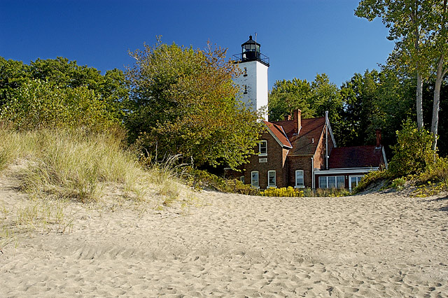
i think i would have like this more if it had been shot more from the right, so that the tower would be completely visible and so that the two trees on the right would not be in the image.
I would've try a different angle (more to the right), focus on the beacon alone (and the surrounding trees, which give beautiful framing and contrast to the red r9oof and walls) and cropped the sand.
For the masters' challenge I would have expected something a little more interested. Maybe a different angle or something would make this a better picture. It's just cluttered. Maybe get closer to it, grab a wide angle lens, walk up and get more of the building a lighthouse instead of all the sand and trees (4).
You have captured my happy place. I am deeply moved by a sense of calm with this shot. Beatifully composed to be a hopeful, pretty, safe, warm and wonderful shot/ andx its nice in the day.
Yes it is but you have to almost search for it. It gets lost in the rest of the shot, the sand, the trees are all fighting for my attention, a closer shot of the house with beacon would really help this shot jump out more at me. Or even the dunes or the sea or lake behind you. A 7
A very nice scenic. I'm sure the exposure is right on, but I wonder what it would do with it deliberately darkened and perhaps a warming filter added? It's still an excellent entry and obviously fitting for a master's camera.
For me this scene is just not captivating enough. While your scene is OK, it seems that you have brought nothing fresh to way in which it is shot. This is exactly how I imagine most snapshots would frame the subject: eye-level, fairly central, etc.
The element of creativity is missing here which is what I'm rating highly in this challenge rather than those who are blessed with simply attractive scenery or subjects to 'make' the shot.
Very nicely exposed and contrast is very good. I think there is too much sand in the foreground and could use less (maybe even half of it needs to be cropped). It also appears to be slightly oversharpened. 5
beautiful scene, I might have cropped a little tighter at the bottom and left side to bring the lighthouse a little closer, but thats just my backseat opinion and it is quite nice the way it is.
this is a clean crisp image and a calendar type one. Caught too closet to the apex of the sun which is not the best for a dramatic effect. Yes, it is attractive and the colors are very nice and the technique is good, However, the image remains static.
Yet the good exposure brags about the good sand rendition. The texture here is convincing and the the composition is pleasing. 6
A nice shot here, brilliant colours and clarity. I feel there is too much of the sand at the bottom though, I want to be looking at the building, not the sand. 7
Nice scene, a bit neutral atmosphere. I can't help thinking that moving a bit further to the right and some less foreground sand would have improved it.
I like this and the colors are excellent. I think a bit too much sand in the foreground and that tree in front of the lighthouse really needs to go. Short of a chain saw, perhaps you could have used another angle. Good job.
Hmmm...this might be more interesting in BW, get some more contrast in the tones. As it stands, it's a tad flat for me. If you were more to the right, maybe to get more of the lighthouse, more of a straight shot of the sand and less of the trees...it could be better...but it's very nice, I enjoyed! Thanks!
Great setting but with just too much sand. If you could have given more sky and cropped the beach just behind the first abrupt rise, I think it would POP. IMO the sand overpowers the beacon and wonderfully clear sky. 6
To much foreground for me, and I think I might have tried darkening it a little. We had our first frost this morning, and I wish I was in this picture. It has a warm and breezy feel. Nicely done.
This shot doesn't really do a lot for me... it's the composition that I feel really lets this down. The Beacon looks like it just happened to end up somewhere near the middle of the frame, and there is no clear pof... there are too many cluttered distracting elements here. The foliage looks oversharpened. I like the fact that it looks like you used a polariser. 5
I like lighthouse images and this looks like an interesting place. I think though, that this shot has too much foreground in it and I wish the main subject wasn't occluded by the trre in front of it.
undoubtably this is a gr8 photo though i would personally like to see less sand and more of the beacon..... i feel that the sand is too overpowering especially being in the foreground of the image... i slight cropping i believe would improve this photo drammatically though thats my honest opinion its hard to say without seeing the results... congratulations though on a gr8 photo
Good photo! I love lighthouses, and I like the way the grass is growing in the sand. The only problem I have is the subject. It's sort of obscured by that large tree. I don't know how to improve it, unless there was a different angle to still include the dune or another like it while getting more of the beautiful lighthouse. 6
This is a really neat picture. I like the feel of the cozy house being tucked away from the beach. It is beautifully clear, and the colors are great. I gave this an 8.
I like the way this makes me think of holidays by the sea and of a little private hideaway. Nice choice to make the sand so prominent. 7 (//www.dpchallenge.com/forum.php?action=read&FORUM_THREAD_ID=129433)
Great colors here... there's a bit of a halo where the trees and sky meet, but beyond that, the deep blue sky balances nicely against the light sand. Moving the composition down just a bit in the frame would have given the shot even better symmetry. Contrast and exposure are spot on.
pretty colors - potential jigsaw puzzle - I would like it even better with the bottom 20% and right 20% cropped out, I think - or if you moved to the right and kept the tall trees, blocked the lower house a little, and got the whole height of the lighthouse
Good colors, good lighting and well done. But I would say that I have seen better subjects.
Of course I'm being a little tough on you because this is masters...
I think this one would have greatly benefitted from a lower sun location to make the scene a little warmer. Also, perhaps sliding to your right a bit would have showed just a little more of the lighthouse (which is very cool, by the way)
I think this shot is a bit too oversharpened. I notice it most between the trees and sky. I think this would look nice in black and white, as the colours look a bit muted and don't really add much to the shot. A nice nostalgic B&W would look a lot better in my opinion :) 6.








 Add photograph to your favorites
 Add photographer to your favorites

 Photographer found comment helpful.


