Somebody offered us this anthurium plant at christmas, I was not too found of it, looks so artificially waxy, until it inspired me all kinds of more or less tastfull photographic ideas. Thanks for your critics and appreciation.
There are no technical flaws in this execution. The background illumination is very well achieved bringing the viewers sight directly to the subject. At that point, there is a little lack of light right at the union of the flower and the wine (and I am guessing it's wine, since it's too dark) If the glass of wine had it's own transparency with light, the color would nicely match with the red flowers, and I believe it would make this a very special image. Focus is exact. The nuts detail is very good, although the setting looks a little bit too much of a setting, and the perfection of the flowers provides an artificiality feel. As humour goes, I certainly smiled when I saw this. I like this one very much. Congratulations.
I would have never thought of this, great humor and nice setup you have on this shot. The punch of color the flowers provide make this shot even more interesting. Surely made me smile!
One of my favorites for the challenge. I just wish there was a bit more light on the glass and the leaves surrounding it. That is your focal point and it seems to be darker than the rest of the shot. Super creative!
Nice idea!
I like the composition, altough I think that a more horizontal angle would have a better effect on the table. Adding the bowl of (?)nuts(?) makes the scene more interesting.
One thing tough, the scene looks underexposed. The wine is shifting to black, the greens are rather dark, the shadows hold little detail and the white wall doesn't look white. Not because the whitebalance isn't right, its more an underexposure thing. However, the exposure of some of the 'nuts' is very good, and some of the flowers are well exposed too. (This monitor is calibrated)
I think that this picture can benefit from two possibilities:
1) More light from beneath to fill in the shadows, plus perhaps another light on the wall.
2) Exposure compensation / exposure bracketing
I might tell you something you already know; The white wall fools the camera's exposure meter, just like snow. It measures something to bright for its reference of 18% grey and chooses an exposure setting that compensates in the other direction. But that leads to underexposure of the scene. I think that this scene could benefit from a 1/3th to 2/3th wider aperture or the equivalent of shutterspeed for that (1 stop wider aperture is equal to a doubling of the shutter open time). So when you don't wan't to mess with the depth of field, you need a longer shutter.
Good sharpness, focus and depth. Colors look very natural (altough dark), so the whitebalance seems ot be good.
Anyway, I like this pic and there is one of the better humour shots, so I gave it a 9. Would be a 10 if it weren't for the things I told above.
(I was still in Critique Club mode, so that's why I got carried away with this reply)
Great fun, nice effort. I would have prefered white wine myself.
The image may have been better if there was a way to backfill the shadow areas with a bit more light. Not necessarily another flash, but a reflector would have been good. All the same, my pick of the week. 8 Morgan
This really did make me laugh. It's perfect. It looks just like the plant is reaching out to get a drink. I love the background. Perfect for the shot. Nothing distracting. Lighting is good. No distracting shadows, no hot spots. You did an excelent job keeping reflection and glare off the glass. I only wish the plant didn't look spray painted. minor detail though. Great focus and clarity. Very nice. Good luck in the challenge.
Great imagination here. My first thoughts were that it was just a pic of flowers, but as the pic became more visible on my screen, I recognised that this was a brilliant idea. Very creative! Excellent. GL







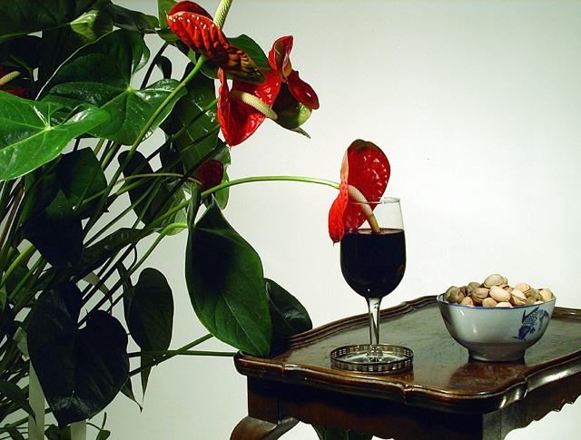
 When was the last time you watered the plants, dear?
 Add photograph to your favorites
 Add photographer to your favorites


 Photographer found comment helpful.


