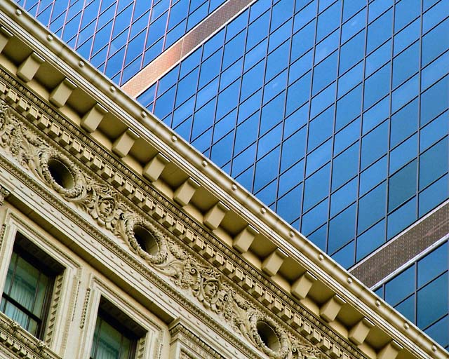
I was very influenced by an image done by Victor Servent whose work I admire. The similarities are the comparitive architecture in each shows a classic style, his is ancient Roman, by a modern style. I have done comparitive shots before but seeing his image help me see and do this one. So a homage if you will, to Victor.
This is a small portion of the Reading Terminal Building by the Aramark Tower on Market Street in Philadlphia.
Post: Layer adjustments for Levels, Brightness and Contrast, Hue and Sat. USM. Crop. Bump saturation and then felt it was a tinge to much so I desaturated a bit. A nit pf pin cushion distotion adjustment was done as swell. Resize. USM.
Statistics
Place: 10 out of 148 Avg (all users): 6.3594 Avg (commenters): 7.5000 Avg (participants): 6.2857 Avg (non-participants): 6.4257 Views since voting: 2137 Views during voting: 317 Votes: 192 Comments: 30 Favorites: 3 (view)
Wonderful composition. I really like how you cut the frame in half diagonally - it echoes the divide between the old and new styles of architecture within this city. I also like the two golden window lines of the new building - they definitely add to the overall pattern for me. This is one of my top 10 for this challenge.
Good eye, good composition, I'll be on the lookout now for similar photos to take. What hurts the picture though is the blurriness of the central dividing line created by the edge of the 'intricate' building. If it had been razor sharp would make the photo really pop.
Contrasting architectural styles in a very fine image. Quality is exceptionally good and fine detail without pixelation makes this one of the top images of this challenge.





 Add photograph to your favorites
 Add photographer to your favorites


 Photographer found comment helpful.


