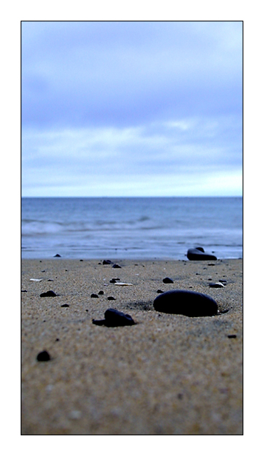
I know the composition is kinda strange. I decided to go with this one despite some people might think the composition is bad. I think the composition is good. With this picture I'm trying to show the balance between the beach, the sea and the sky. When I took this picture I was the only one on this small beach and it was just so peaceful. And I think this composition shows that the best. Hope you understand me :)
Statistics
Place: 104 out of 219 Avg (all users): 5.5478 Avg (commenters): 7.0417 Avg (participants): 5.4923 Avg (non-participants): 5.6200 Views since voting: 1511 Votes: 230 Comments: 29 Favorites: 2 (view)
I see what you were trying to do with the composition here, however I personally don't care for it. I think it might have looked good if you had cropped off right below the second big rock, and I think that for a few reasons, 1) it would have shortened the picture some, not making it so upwards and narrow, 2) I think it would have showed a better balance between the beach, the sea and the sky, as you say it was a small beach, so I would expect to have less of the beach in the photo, to show the balance, this is just personal preference.
I love your use of color here, the sharpness between the beach and the water, and then the subtleness between the water and the sky is very soothing almost.
Your use of DOF is very interesting, I I like how the water and the sky aren't as sharp as the beach, but the bottom part of the beach sort of bothers me, to others this was a plus though, so I guess this is personal preference.
I like your angle here, I think it is very interesting, the way you have the rocks on the ground in the foreground, it really looks like you could walk out into the water :-) I'm not sure if I would classify this as a landscape however, yes there is some land on it, however I think it might have been better for the challenge is you had shot more horizontally instead of vertically.
I am not a big person for a lot of borders, and here I think you definitely overdid it some. It's not good when the border takes your eyes away from the photo, and the bright white of this border, seems to take my eyes, instead of what you want me to look at, the substance of the photo. If any border, I probably would have gone with black, though a good photo like yours shouldn't need an added border.
I think this was a very interesting picture, I think it didn't place as well as you would have liked due to the non-landscape nature of the photo, also the DOF probably was not excepted very well. This is however a beautiful picture in and of itself, and I think that its quite peaceful and lovely. I think you have a nice work of art here that I could easily see hanging on the wall of a beach house :-) Good luck in your next submissions!
Great use of DOF. A bit too shallow for mytaste, I would have liked to see foregound in focus, too. Creative cropping. Normally people would have used landscape format. But I really like the format you chose. The border is a bit too wide. Making the actual photo a bit bigger would be a better use for that space.
I like the blurring in the back, but I'd like to see more depth of field in the front. I find it a bit disorienting. I still like the shot because of the three distinct "layers": sand, water, sky. Good luck. Jacko. 8
Gorgeous! I love this. The shallow DOF is great, the narrow cropping, and the small size (plus the big border) all work together in this image. My attention comes right down to that one, smooth pebble on a timeless beach. Very littoral :) (I love that word). 10 from me.
This is a kind of abstract shot I always like. Simple, yet pleasing to look at. Who knows, it may be even better with no rocks, just two horizontal lines, and 3 different "textured" areas. The only technical problem is depth of field - its a little too narrow for this kind of picture. In this scenario I do believe the photo would be improved if everything was in focus.
I really like this one...great depth of focus and I love the colour. The balance and symmetry in the sand, ocean and sky is great. I can hear the 'out of focus' comments from here! Good job.
I love the simplicity of this photo. Great colors, dof, and while the composure is a little unorthodox, it works extremely well here. I think the exaggerated verticle cropping really benefits this image. Great job!
Awesome awesome use of DOF. Beautiful colors. I love the layers, color, and lighting. Beautiful, and I hope it isn't penalized for not being a traditional landscape.
Nice, but needs more DOF. Look how the sand in the foreground and the sea in the background are out of focus. Try to have the stones and the sea in focus, and crop a little from the bottom.
I really like this photo, excellent use of DOF, but I am very sorry to say that it doesnt really fit into my definition of landscape. I would vote it 10 if it were on topic!
I woul dhave liked the beach sand to be in focus at the very bottom and just the water blurred, but still the shot it cool. A beach to me is surely a landscape and for such a neat perspective I give it a 8.





 Add photograph to your favorites
 Add photographer to your favorites


 Photographer found comment helpful.


