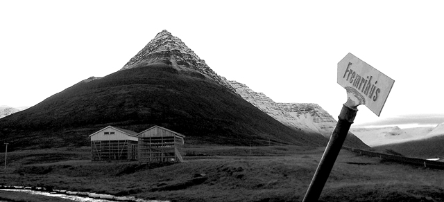
It would appear that the foreground is in the shadow of a cloud or possibly another mountain. I see that the background of the picture is brighter. I see three things fighting for attention here. The sign, the buildings and the mountain. The eye wants to go to the brighter area in the background, but the sign is in the way. I would have recommended that the photographer waited until either all the area was in sunlight, or all in shadow, for a more even photo. The sky has essentially become negative space. If you take the sign out of the photo, it loses something, but the sign is a bit distracting the way it just pops up in the picture. Perhaps standing further back, so that you can see the base of the sign would help. I would also recommend having waited for better or different lighting if possible.
As it is, your exposure control was very good for the wide range of light you were trying to capture. Focus is very good as well. I believe you were right in choosing not to do color.
Did you chose black and white cause the sky was white and blank? I'm seeing white sky in a lot of shots this week. must be the weather.
no,in fact the sky was very cool, but the houses and the mountain were badly underlighted (or how it's said)... so I just tried B&W and it turned out much better...
Did you chose black and white cause the sky was white and blank? I'm seeing white sky in a lot of shots this week. must be the weather. Anyway, I like the choice for black and white, and I think that is makes the white sky not so bad. It's a lovely mountain. Looks like a pyrimid. I like the angle and framing/cropping you chose as well. Having the sign in the front, although I have no idea what it says, is very nice. GOod shot. Good luck in the challenge.
A great postcode like photo. The falling over signpost has an almost comical quality to it - which I like a lot. I think black and white was a good choice for this photo (I think a lot of people overuse b&w). Well done.
If you're gonna stick that sign in there then I think you shouldn't have cropped up so high so that it's just floating. The mountains are really cool. I think maybe you could have used a perspective from more to the right that would show the ridge better and the mountains in the distance.
I don't know what it is about this shot...I guess the title says it all. My only suggestion woudl be to have cropped out the visible powerpole on the left, you would not have removed barely any of the shot and one less man made thing to take away from such beauty. 8.





 Add photograph to your favorites
 Add photographer to your favorites

 Photographer found comment helpful.


