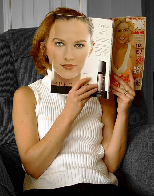
Something I've wanted to try for awhile. It's hard to find a magazine that will work. Not to mention a Wife that will work with you! I tried it without the desaturation which I'm afraid is being overused, but the green color of the chair really overwhelmed the shot along with the gold background. Hopefully this works.
Cropped, Sharpened in Neat Image, Desat, adjusted curves and color balance and hue saturation. Resized added a 1 Pix border and submitted.
Statistics
Place: 27 out of 69 Avg (all users): 7.0376 Avg (commenters): 7.5500 Avg (participants): 6.5254 Avg (non-participants): 7.1265 Views since voting: 7512 Views during voting: 1148 Votes: 399 Comments: 122 Favorites: 24 (view)
Statistically this was one of my favourite shots from some time ago , decided to review some old favourites and guess what , this is still there and definately deserves another airing.
Well, this was a creative entry and in very good taste. It shows that the urge to differ from the norm can be done by the mere flair of being clever. I loved this image.
Thanks so much for all of the comments. I took this one morning before church as my wife was dolled up. The ugly background was even worse in color and the reason for the DeSat. If I had it to do over again I would certainly use a plain background and a closer crop. It was an honor to compete and a blast to read all of the comments all week.
I am just appalled that this didn't finish somewhere in the top 5. I seriously thought this would be a ribbon. Oh well, at least I got to enjoy skiprow's comment. ;-)
THis was set up well and I like the subject and pose. I think the light backgroun at top is distracting and think that something might have been done about that.
I think your concept is one of the most creative of the challenge. However, I really don't care much for the background. The magazine made me really analyze the face to see just how well you lined everything up, and I must say you did well :)
Interesting photo - not something i would expect in this challenge. For me it is distracting that i can not see more of the models face. The composition is also lacking.
i know i'm going out on a limb here, but, shannon, is this you? (if not, i've confused you with one of the most creative minds on this site.) this shot exemplifies what can happen with skill, creative vision, and experience come together. great job! this is one of my top picks for the challenge. good luck!
Clever idea and well executed. The selection of the setting works well, I especially like the harmony in the sweater and the white woodwork behind the chair. The only thing I don't approve is the title, it doesn't add anything to the shot. I think this shot can have a title that has humour or raises questions about beauty and identity. -8
It drew my attention instantly. Great idea and execution. I would only use pure gray background if possible. BTW the girl's outfit fits the image perfectly.
returning for comments.
This is simply hilarious and a very clever juxtaposition. I would have changed the top because of its ribbed effect in this casual position. That is, the ribs then fall into furroughs. But hey, all is not lost because the smart idea of the magazine carries the great interest. Bumping again to 7
pretty tricky; the head is a little big but you are a cunning trickster with a great eye for interesting elements, (the rolls on the shirt... the details on the chair)
This is an interesting image. The exposure seems bang on though a reflector may have helped on the right to add light to the left side of your model. The hair on the your model's right (image left) detracts from her face blending more with the magazine. If it were pushed back I think the blend would work even better. Good choice of background. 8
This is a fairly goos concept but the shot does not grab me otherwise. Yes, the magazine makes her face but why? What else is there going on and there has been little other creative input to the shot beyond the use of the prop. The background is dull and this ultimately looks like a humourous snapshot. Sorry not to be more positive.
I love this ! At first glance of thumbnail I thought "what is this". An excellent idea and statement. I love the match of the brow and hairline. The background gives it the waiting room feel. I hope we get to see the model after voting. -Back after voting- bumping this study up, agin nice work.
This is so cool and it was pulled off quite sucessfully. I know it's not perfect but considering it's a magazine cover, it looks REALLY good. Skin tones are even a close match. The only thing I'd change is possibly the chair and definitely the background. Not quite sure what kind of overall look you wanted to give the photo but it feels too much like a living room. That aside, it's very good technically. 7
this is such a neat photograph. I can't believe how well the magazine back cover and the girl's face are aligned and blend into each other. I can see a photo like this being used in an advertisement in a woman's magazine like the one your subject is reading. Excellent work. 8
Seen something similar once (with a mirror, dont know what challenge it was) but it's still a nice idea and very well executed...
Also a bit of humor... Great work thanx for sharing.
Strong points: PERFECT alignment and darn close on color matching. Your lighting and exposure was right on - her white top has lots of detail and texture. Great idea well executed. Suggestions for improvement: The vertical lines on the wall behind her head are bothersome.
interesting idea - a lot like Alecia's Mirrors entry, which i also liked a lot. The eyebrow is a perfect touch, though i can't tell if it's real of edited (which is a good thing). The 'rest of the scene' could be more interesting (or less, as the case may be). as it stands it's pretty random. I'd likely have tried to make te whole backdrop uniform, rather than allowing the white to show through at the top. all in a ll, a very good shot. i like it.
This is one of those shots that I think 'So What' Then when I actually look a lot closer, it really starts to grow on me.
The way that you've lined up the magazine with her faces is briliant! The eyebrow continuing from the real face to the magazine is a great touch! Lighting is brilliant, so is the exposure. Well done! 9
How fun was this shot to shoot? It really caught me of guard at first, I was trying to figure out just what you did and then I saw it, the way the eyebrows line up so perfectly, well done. The only thing that could have made this perfect is if her hair and the models hair was the same color or if you at least pulled her hair back to match the hairstyle on the magazine. A 9
A cool idea, and it's actually well done, but there's too much 'other stuff' in the picture to distract me. Perhaps a tighter crop of the face and magazine would have been enough for my tastes?
Great idea. Some small mismatches between the magazine and the model's face are the issue. The hair curling into the neck is probably the thing I noticed first. Other than that, this is incredibly well done.
This must have taken you a few goes to integrate the magazine with your model so flawlessly. I have to say though that this photo doesn't really do a lot for me... I see a well taken snapshot. I don't know why, but the edge of her left arm is grey... what did you do in PS that resulted in this?! 4
Very interresting. I like what you've done, but find that the inclusion of the front cover of the magazine takes away from the overall look of the photo. It gives it a kind of snapshot feel.
a very clever pose, well composed and well lit. I think the setting could have been better owever. The chair is too big for the scene and the vertical blinds clutter things up. I think a tighter crop of this shot emphasizing her head, hand and tthe magazine would be terrific.
Brilliant! I don't think I've ever seen this exact technique before. Her skin, especially her left hand and arm really match the back-cover girl's face perfectly. Did you have to do any postprocessing to match them this well?
Brilliant in composition and execution. I wish that the girl on the front cover had been hidden or cropped though. Her face competes for attention and detracts a little from the somewhat startling impact of the main subject. However, the thought and work that went into this shot are very evident and will surely make it a top scorer.
I gave you a ten. Very well executed photo. More importantly you thought about what you wanted to do and it was setup and composed perfectly. I have only been into photography since May of this year, and its photos like this that keep me inspired. A 10!
A very humorous entry that made me smile. I just think that you have too much of her body showing, and that it takes away too much from where you want the focus. I find myself drifting to the torso far too quckly, and the front cover of the magazine is also a little too busy and perhaps too prominent. 8
Great idea, very creative! The only thing I would change is the surroundings. I like how it lines up, but it would be better on a chair not so large with a white background, in my opinion. 6
I really love the creative idea in this image - it works really well. Especially the way in which the eyebrows are so perfectly aligned.
What lets it down for me is the background. I'd prefer a single background, either a taller chair back or some way of ensuring continuity. As it is I find the lines of the surface behind the chair visually unappealing. 7 (//www.dpchallenge.com/forum.php?action=read&FORUM_THREAD_ID=129433)
Very cute shot. The veritcal wall detail directly behind her head is a bit distracting, but the alignment and skin tone match really makes you double-take this shot. Lighting is solid, neutral color choice on the hair, furniture, and room (whether done naturally or with desaturation) keeps the focus in the right place.
This is an excellent photo. I love the theme... I think a tighter crop would make it even more perfect, IMO. This also makes an excellent black and white.. I played around with it some to confirm that suspicion, but it's just my preference :) Great shot...
Very creative idea, I like it. The match is not perfect, but I don't care. I think you could not have moved the magazine closer to achieve a perfect match with the face and at the same time have a natural look with a normal reading distance. What I do find disturbing are the imperfections around the edge of the desaturation, especially the edge of the left arm (viewer right) holding the magazine, a part of the hair and a small spot on the magazine.
Wow! So simple but so effective. I really like this little gem.
Background and chair are not my favourite setting but the cleverness of the shot stands out. Good exposure.
Did you plan this out or was it fortunate circumstance?
Good eye nonetheless.
Nice idea. The illusion would have worked a little better with the magazine closer to her face. As it is, the head on the magazine is larger than the woman's.
Clever shot. You got the faces to line up really well! I think a more interesting chair and background would help the photo tho, it looks a bit snap-shotty at the moment, in my opinion. 5
Wonderful idea & a great shot. However, I can't fail to notice what's going around her arms. Looks like a pretty bad desaturation job ruining a great shot.







 Add photograph to your favorites
 Add photographer to your favorites


 Photographer found comment helpful.


