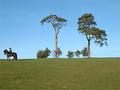
I think that one of the things that might have hurt your score is the picture's size. Smaller pictures tend not to do as well because the details are harder to see. While I am not a rule of thirds purist, the centering of the main focus of this picture results in the building on the right being cut off. It tends to be a small but jarring end to the direction the eye wants to move. The darker patch at the bottom of the screen tends to act as a barrier to the eye. I don't know that cropping it out would have worked better, but it might be something to try, or to have approached the scene at a bit of a different angle to use it to lead the eye into the scene.
Overall this is a very good picture. I believe that your score should have been higher, and as I mentioned before I suspect the size to be part of the cause. I really like the overall exposure. Even though it tends to wash out in places, like the sky above and to the right of the trees, I think with this scene it works quite well. I especially applaud your manipulation of the colors. Had this been straight color, or black and white, this picture would not nearly have been as strong. I really like the mood the coloring sets in this piece. Focus, contrast, and exposure are all very, very, good.
Thank you for your detailed comment. I agree with most of your points. Only, I had thought that the line of vegetation at the bottom of the picture added something to it, but I may be wrong.
In addition to that comment I would like to mention something as well.
The choice of the white border isn't that good imho. The big blow out above the trees runs into the white border and that leads the eye out of the picture. Taking the view away from a well presented scene. Perhaps that black or a brown tone would do better, it would cut off the blowout and leave the eye in the frame.
I think that one of the things that might have hurt your score is the picture's size. Smaller pictures tend not to do as well because the details are harder to see. While I am not a rule of thirds purist, the centering of the main focus of this picture results in the building on the right being cut off. It tends to be a small but jarring end to the direction the eye wants to move. The darker patch at the bottom of the screen tends to act as a barrier to the eye. I don't know that cropping it out would have worked better, but it might be something to try, or to have approached the scene at a bit of a different angle to use it to lead the eye into the scene.
Overall this is a very good picture. I believe that your score should have been higher, and as I mentioned before I suspect the size to be part of the cause. I really like the overall exposure. Even though it tends to wash out in places, like the sky above and to the right of the trees, I think with this scene it works quite well. I especially applaud your manipulation of the colors. Had this been straight color, or black and white, this picture would not nearly have been as strong. I really like the mood the coloring sets in this piece. Focus, contrast, and exposure are all very, very, good.
interesting, i wonder if the fact you framed it before submitting makes it more appealing, fortunately i have neither time nor will to copy and cut it, would love to know how you did it as it is a sweet affect. 7
I have enlarged the canvas before submitting. I think it helped creating a floating effect. However not evreryone like it but I think this is a matter of taste. Thanks for your comment!
Beautiful scene. I love that you shot the long foreground. The only think that I would make it better for me would to have the small structure in the picture entirely, I know that sometimes it isn't possible but it would keep me inside the photo rather than searching for something outside the frame.
You are right about the small building, my mistake.
Thanks for your comment!
The choice of white border with that washed out sky is very, very questionable. If there was any doubt to if the sky was washed out, you've taken that away. I dislike these little wallet size pics as well. Technically though, the sky is washed out, the framing could be better, the crop could be tighter to eliminate some of the foreground distractions. The color tone of the pic is pretty nice though. Good luck - Inspzil
Well, I'm new to Photoshop and did not know how to change the color of the frame so......! I did not retouch the sky, it was shot that way. I loved the foreground kind of wheat line and intentionally left that there, it's a question of taste I think. Thanks for your comment! Really appreciated!
I think this is a superb picture, full of mood, which is helped by the wonderfull colouration. I particularly like the way the top of the picture fades out into the border. However, at the same time, I feel the border is a bit of a distraction because of it's uneven proportions. This is particularly noticeable at the bottom corners. I think if you had kept the proportions even all around it would have added even more to the charm of the image. Even so - an excellent shot.
I am hoping this picture is not made from a reciepe....... Outstanding presentation......... beautiful home/farm that matches the drug store print frame perfectly........ your creative processing is flawless and displays an intutive knowledge of recent foto history....... truly "refreshing" picture
That do you mean a recipe?? (sorry I don't get it!) !! It's a house on my way to work. Thanks for your comment!
A bit bright on the eyes at the top middle/right, and it's a tiny bit small. It would have looked perhaps a bit better if you had removed the half of the building on the right and made the photo a bit bigger. -Annida
Quite right about the building! Thanks for your comment, very helpful!
Nathalie
Pretty nice composition but it seems too small and too yellow.
YOu would have liked it more of what color just so I can improve? And when you say too small you mean the house is too far? I thought that the fields in front were creating some sort of mellow mood...
Thanks
A building was chopped off. I like how the sun is trying to get through the clouds.
You are right. I was packing for vacations and just entered quickly in the challenge before leaving and did not have time to really retouch the shot. But indeed, it is strange to have cut this building in 2... Thakns for your comment!
A bit bright on the eyes at the top middle/right, and it's a tiny bit small. It would have looked perhaps a bit better if you had removed the half of the building on the right and made the photo a bit bigger. -Annida
I am hoping this picture is not made from a reciepe....... Outstanding presentation......... beautiful home/farm that matches the drug store print frame perfectly........ your creative processing is flawless and displays an intutive knowledge of recent foto history....... truly "refreshing" picture
I think this is a superb picture, full of mood, which is helped by the wonderfull colouration. I particularly like the way the top of the picture fades out into the border. However, at the same time, I feel the border is a bit of a distraction because of it's uneven proportions. This is particularly noticeable at the bottom corners. I think if you had kept the proportions even all around it would have added even more to the charm of the image. Even so - an excellent shot.
The choice of white border with that washed out sky is very, very questionable. If there was any doubt to if the sky was washed out, you've taken that away. I dislike these little wallet size pics as well. Technically though, the sky is washed out, the framing could be better, the crop could be tighter to eliminate some of the foreground distractions. The color tone of the pic is pretty nice though. Good luck - Inspzil
Beautiful scene. I love that you shot the long foreground. The only think that I would make it better for me would to have the small structure in the picture entirely, I know that sometimes it isn't possible but it would keep me inside the photo rather than searching for something outside the frame.
interesting, i wonder if the fact you framed it before submitting makes it more appealing, fortunately i have neither time nor will to copy and cut it, would love to know how you did it as it is a sweet affect. 7






 Add photograph to your favorites
 Add photographer to your favorites


 Photographer found comment helpful.


