Nostalgic scenes are some of my favorite subjects to photograph. I guess I feel like I am somehow preserving a piece of the past when I can capture an old vintage setting like this one.
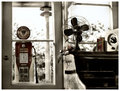
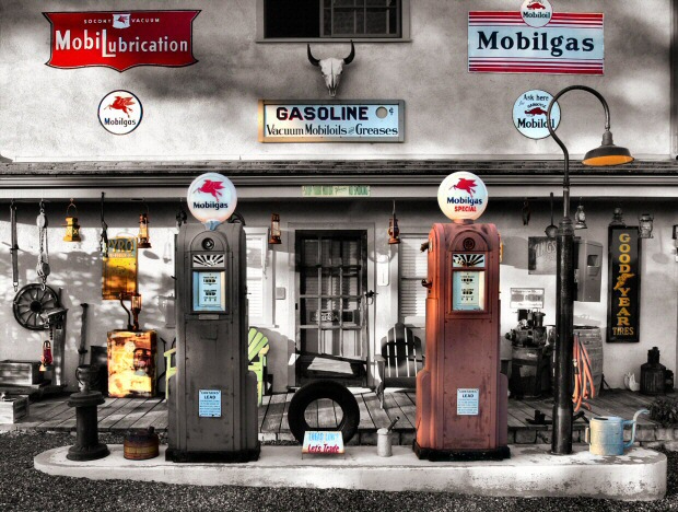
This is an actual station set up on a rural road in a remote canyon. It's not a studio setup or a display in an amusement park. I drove past this early in the morning when it was still dark outside. Some of the lights on the pumps were on so I took a handful of shots just to see how well I could capture this in the unusual lighting. The pictures turned out ok, but the lights were too blown out to consider using it for the challenge.
I hiked up the hill in the dark with a 28-70 lens and discovered I couldn’t fit the subject in the frame even from across the street. I had to walk back down to get the 17mm lens I ultimately used. Perspective distortion became a problem and I ended up correcting it with software.
I set up the reflectors and patiently waited for the sun to peek over the mountain. When the first sun fell upon the subject, I started shooting the daylight pictures from every angle and bracketing exposures for the rapidly changing sunlight. I got in about 45 shots before the light became undesirable with hard shadows. Only 12 min shooting time. This is the only time of day to have the soft natural lighting cast on the front of this building.
I ended up with what I think is an excellent photograph of a vintage looking setting.
The color version was busy and it just wasn’t grabbing me. I greyscaled it, and it looked like it was taken in a miniature museum. Ugh! I needed a dog or a human in the shot to add an element of reality and dimension of comparative size.
I couldn’t decide between color, or black and white. I did some selective desaturation and ended up with this combination of both. It has a "Roger Rabbit" feel to it now, But I like it. I love pictures that seem to asthetically defy principles of composition.
I don't think of this as digitally manipulated art, I see it as a Black and White enhanced color photograph. But what do I know? I don't consider myself a "master" in any way. I'm just a hobbyist, so I am prepared to walk away happy with last place in this challenge. It is a privilege to be included in this list of creative minds. Even if my picture doesn't do very well in this challenge, I feel like I have already won.
1- I corrected the perspective distortion.
2- I dodged some of the shadows and I burned some of the highlights back a little.
3- Adjusted brightness and contrast
4- Boosted Saturation slightly.
5- I cloned out an annoying shadow on the upper left wall.
6- I did some tedious selective desaturation.
7- Added Gaussian noise.
8- Re-size
9- Crop
10- Save as jpg
11- Applied Unsharp mask slight
From EXIF:
Nikon D1X
9/26/2004 7:31: 22.1 AM
Shot in Color
Tiff RGB 8 bit
Compression: None
Image Size: 3008 x 1960
Lens 17-35 F/2.8-2.8
Focal Length: 17mm
Metering Mode: Multi Pattern
1/160 sec – F/6
ISO: 125
Color Mode: (sRGB)
Hue Adjustment: 1
White Balance: Auto
Statistics
Place: 16 out of 69 Avg (all users): 7.2601 Avg (commenters): 8.2308 Avg (participants): 7.1607 Avg (non-participants): 7.2765 Views since voting: 8795 Views during voting: 936 Votes: 396 Comments: 115 Favorites: 68 (view)
It's a really super shot. It takes quite an accomplished eye to see the photographic possibilities in the ordinary. Mist and water and clouds and cows, and shiny things and rocks and photogenic people are easy subjects. Gasoline stations, I think, are more difficult.
As for placement, this has got to be a tough category. I'd encourage you to consider your success in terms of your score which is really high. Take more shots of mundane things and make them beautiful! What could be a more powerful way to beautify the world than to transform caterpillars into butterflies?
Thank you all for the encouraging words and all the great comments. I am not disappointed at all with my placement in this challenge. To me it's like trying to compare an orange with a cat and having to decide which is better. (Ok, well a cat would be a bad example on DPC, but you get the jest of it). Pictures of children don't seem to do as well on DPC either, but Sher9204's shot was my highest rated of the challenge. Honestly, how can you compare a child with a gas station? I know I bent the rule of thirds and broke several other unwritten laws of composition with my gas station. I am just ecstatic that this shot was so well received. This was a fun challenge!
I like this one very much. THe old time items are well positioned and nicely desated. the coloring has the feel of a hand tinted print though think that you might have done away with a bit of the fuschia purple at the bottom of the tire, it just seems a little out of place....small nit....
There is so much going on in this picture, that I've looked a few times and still not seen everything! In short, I love it, and I gave it a 10. Wonderful techniques and interesting concepts used here.
This is such a stunningly beautiful piece of art. I worry that it won't get the ribbon it deserves because the subject matter is so unusual, but hopefully the voters will see that the composition and clever color tones throughout the image are so perfectly, methodically arranged that it will get all the 10s it deserves! 10
AMAZING! How big is this scene? The lighting is incredible. Where the cat or the dog? Everything is in its place! (Except for the hose & nozzle on the pumps). Its more like being in a dream than looking at a picture maybe a movie set or in a museum? In any event I like it!
Nice detail. At first I did not appreciate the symmetry, but It works. You really waited for the perfect light and that is commendable. Perhaps the only complaint, --"clutter"? too much for the eye to soak in?
I like the desaturation and the old time feel of this photo. The balance of how everything hung on the wall and around is so amazing. I think this would be better with a tighter crop focusing on the gas tanks, to include the skull. Nice work and hope you do well! 7
You've pulled off a very difficult composition with your use of color and light. Good eye for seeing a scene's potential and taking full advantage. One of my favorites this challenge.
Even though there's a lot of 'stuff' in the photo it feels balanced and organized. The soft colours set a nostalgic mood. The focus seems a bit off as items on the right seem sharper than those on the left. 7
I love this image . The warm , subdued colors of the pumps, I think , enhance the overall quality of the image better than if it had been shot in sepia tone . It bespeaks of a bye gone era more loadly in spite of it's cluttered busy-ness . The early morning, or , late afternoon light greatly compliments the theme of of the past and invites you to literally step iinto scene . Great work ! MG.
Great colors on this one... really invites that retro feel. Looks awfully smooth, though, almost computer-generated. Usually, over-smoothing really detracts from an image, but here, it seems to work well with the almost pastel colors and the subject matter.
i can't tell you how much i love this picture, i will be sad if it does not medal. you did a wonderful job making this photo look as old as the time period of your subjects. 10
Is this a real place? It looks like a Hollywood set. This is by far one of my favorites in this very competitive challenge. The half B&W half color is an excellent choice for this picture. - 10
I keep coming back to this one. It seems a little too busy. Perhaps the shadows are to much with all of the other focal points. I can't seem to find any one thing that I'm drawn to except the red sign on the top left and that leads me out of the photo. For some reason the sign on the left gas pump is a bit fuzzy too.
A great image stamped by the style of the miniture because it instantly entrains the mind to consider is it real, is it miniture..or better am I dreaming. yes, this is a dream of nostalgia. Yes, the scene is real but I am ina dream. Wow! my warm congratulations for adding this lucid dream into the challenge. Bumping up to 7
Quite a collection. Nice job of mixing color and desaturation. Only problem is that it is quite flat and has very little dimension to the viewer. The WOW factor is just lacking. I like it otherwise. 6
Funny shot here, looks a little too perfect. I mean that in a good way though! Is it a model or somehting? I think it looks too clean to be a real place.
Great shot though, not many makes me think like that :-) Nice and clear, loads of things to look at. Well done! 9
10! Having worked in the billboard industry for 8 years, I have a certain interest in old signs. I love the layout here, the old gas pumps... the colors are fantastic! You've done a great job.
OH, what classic Americana! This...is...a wonderful shot! I'm really impressed with it. It's so overboard, and in such a good way! Great shadows, great color, very clever and unique! I really dig this and damn if I could vote on this challenge, it'd be waaay up there. Thanks!
What a great find! It's busy, but in a good way. I like the desat treatment you used, it brings a lot of interest to the photo yet tones down some of the "clutter" of the shot. Very interesting and one of my favorites of the challenge.
Love the nostalgic look at a small town gas station (from the southwest?). I especially like the mottled lighting, although some of it looks to have been manipulated in ps. This image has an almost surreal quality to it, as though what I'm looking at is a model, rather than a real place (maybe because the clutter in the scene is so well organized and because of the wide angle giving it a distant appearance?) In any case, well done. 7
I love this shot... but I'm not really a fan of centered compositions. I can't help wishing you'd gone for something more imaginative. Everything else is perfect... the pastel colours, sharpness, subject matter, light, PS work, just superb. I wonder if you could have fixed the distortion from your wide angle (or the converging verticles from looking up slightly) which is evident by the signs at the top of the frame. 9
Is this real or a diorama/model? If this is a model, I am VERY impressed with the level of detail captured in the photo but the composition feels a bit busy. I like the soft colors and focus. 7
I like the almost cartoon effect. Must admit I was not over impressed first time and voted a 5. However on the second trawl thru, it slapped me in the face and bumped it to 7, maybe third time thru it will go higher
I like this. In another image all the elements might appear to be too cluttered, but the overall impact here works well. I love the lighting and whatever processing you did to get the colors and tones is very pleasing. nice job.
Careful, seamless and subtle (+ & - ?) saturation at luscious levels of intensity. A 1950's superrealistic view - a " Route 66" like roadside impression from the seat of H.G. Wells Time Machine. Tinged with nostolgia an icon of "Americana" - made real..... Accurate artifacts placed in a historical renovation - a Smithsonian exhibit - antique store - museum exhibit - where ever this display is located, it is unusuall -and the visual intrepretation wonderful.
this is a wonderful photo and although i believe the desaturation provides alot (and maybe too much) of a contrast i love the image as a whole. It is a very full on image and provides alot of interesting sections to look at. Overall possibly this image is slightly to compacted though but its still a fascinating look and lovely execution for giving it that added edge... so congratulations on a wonderful image...
Interesting, but there are a lot of subjects here, and the desat doesn't seem to issolate a single subject or class of subjects. So, I'm not sure what the message is.
What a wonderfully cluttered and interesting shot of americana. I can just imagine riding down the street and seeing this. I would have to stop the car, get out, and just look at it for a while until I had taken it all in. The lighting, placement and subject matter is excellent. Great capture
WOW! what an amazing photo! I love the retro feel that you have created with the selective duration...Would love to have a copy of this hanging in my son's bedroom!
The only time I ever enhjoy busy non personal BUSY pictures is if it's very interesting. This is very very interesting. The color ia very well done. The dof is great. I like this a lot!
A bit processed looking for my personal taste, though I know this style appeals to many. Composition and POV feel a little static, straight-on/centered though I guess there's so much going on in this frame, that's not entirely bad.
Excellent use of toning. Good subject to use your skills on. Looks like a minature version of the real thing or fake somehow, perhaps it's the toning or the ground.
I really like the way you've excentuated the certain colors on the building. It keeps the viewer interested My only comment would be that some of the colorized whites look blue. 6
This is so cool- the desaturation creates such a nostalgic modd and there's such great symmetry. I love the mood it gives and how much detail there is. It'd be absolutely prefect if the lighting was more even but I still love it, great job
9
I'd love to see this in sepia... Might help it to feel less busy. Very interesting scene. Would be great if the window wasn't cut off (top ctr.) as well.
A very special image, looks like it was painted with light with all those shadows and highlights. I am curious how it looks without the partial desaturation, the way you have done it is very special, not concentrating on one single item, but maybe just a bit over the top, I am unsure. Anyway a visually fascinating image.
I like the muted colours coupled with the desat here. Where is this. It's almost too
"laid out"..everything has it's place. Very nice nostalgic feel to it. A nice poster shot. -8
Woah, selective desaturation to the max! That or its a very colorless building. Either way, I think the shot is too busy. It's nice that there is a lot to look at and keep interest, because I keep spotting new things, but as a photo overall it just seems to cluttered. 6
Wonderful study of selective use of colors. Like the color in the lamp The blue in the left pump doesn't seem to work as well as with the other. So much to see. like the green chair and the air hose, everything looks just great against the backgound of the building. Great job!
very nice use of selective desaturation, but I find the shot a little too cluttered for my tastes, even with. I can imagine how cluttered it must feel without. The composition is strong, good centering, and a good eye to see something where most wouldn't.
This has the feel of a painted photo, just like the ones that came from this era. So nicely captured, clear, vivid and effective image. It may be just a bit busy, but that could also be a plus. 8
So far...this has to be my favorite ! I love the way it's done. Is this a miniature? I hope to get a email from you explaining how you did this. The lighting and selective color is perfect ! 10





 Add photograph to your favorites
 Add photographer to your favorites

 Photographer found comment helpful.


