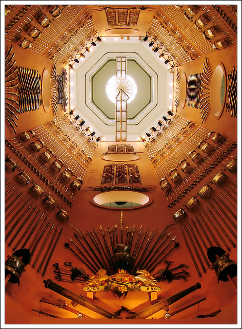
A revisit to one of my earlier pictures... I used ISO200 instead this time, to maximise the dof, but I think I underestimated how much noise this would produce. Therefore, the quality is not as good as my earlier picture.
Statistics
Place: 3 out of 148 Avg (all users): 7.0900 Avg (commenters): 7.9643 Avg (participants): 6.9149 Avg (non-participants): 7.2453 Views since voting: 7209 Views during voting: 406 Votes: 200 Comments: 51 Favorites: 8 (view)
I really like the composition. I find myself turning my head
back and forth to see it at different angles. The lighting is
great! I'm new to this forum so I haven't seen your other picture,
do you still have it available online? I'm sorry I came in too
late to vote, I liked your's the best.
-Nick-
Just look at my profile... at this point in time, it's my highest scoring shot.
I really like the composition. I find myself turning my head
back and forth to see it at different angles. The lighting is
great! I'm new to this forum so I haven't seen your other picture,
do you still have it available online? I'm sorry I came in too
late to vote, I liked your's the best.
I think this is a very interesting shot visually -- and I actually like the crop better than I liked the crop of the original. It sort of resembles a keyhole -- very interesting in its asymmetry. Great job. :)
Congratulations on another ribbon, Bob! You make it seem so easy. I actually like this version better than the first version - more light. I can't notice any noise or even loss of quality from noise removal.
Graphicfunk, don't worry about it!
Thanks everyone, it's been interesting to revisit an earlier shot and see if I could improve on it. I was never that convinced by the centered composition of the last one, but it seems that people prefer it that way. I've also learnt to keep to ISO50 wherever possible. You can't see noise here because I NeatImaged it out, but it certainly doesn't have the detail of the previous shot.
Hey Bob; you got this yellow without my help. Since I had already seen your spectacular image, I assumed this was somebody else's and I did not see how anyone could have improved it. I like earlier better. So, I left you in my placeholder of 5 and that is where you stayed.
I did not know it was you so I am guilty and sorry for overlooking it.
So, as you win this yellow, my hat goes off to you and very smart to have entered this shot. Do not hate me for my oversight.
Congratulations! ... luckily I had enough time before the deadline to get to vote on this. I think the lighting and DOF worked out fine -- any noise is no issue to me.
Well composed image. Where ever I look the leading lines draw my eyes toward the big lights on the ceiling which is well-exposed. One of my top picks. 9
Wonderful composition and great colors. My only complaint is with the white part of the border. The thin black line would have been perfect. It is very strong as is, but try cropping the bottom so that the base is about 1/2 way up the slanted spears.
I've seen this in the free study, Bobster? Recycling your top scoring photo? Its the same photo but with a slightly different composition, I can't give it more than a 6.
I hope you don't mind my honesty, but I don't find recycling previous photos for new challenges to be creative. That said, I'm a fan of your non-challenge work.
Beautiful content and framing. Exceptionally high technical quality. Detail is particularly outstanding. I looked up other images of the Hall of Steel on the Net. This one is infinitely better and certainly one of the top images for this challenge. Congrats on a great image.
Despite having no interest in the steel implements themselves I love the "pattern" of this image. It makes a great geometric abstract and I like the colours, shapes, light and shadows. Not only a great choice of viewpoint but also great composition choice not to centre the ceiling in the frame. One of my 10 favourites in this challenge.
I really like the effect of a 2-dimensional design. Even though you've obviously shot upwards, it feels some Indian design with a pentagon at the top supported by some intricate pattern work. Lovely. 9
Seem to remember seeing this location/similar photo a while back... My only problem with this is it is really difficult to see what it is in the photo. You could have played with that by a title like "Circuit Board?" But as it is, it just looks like a bunch of little 'things'






 Hall of Steel
 Add photograph to your favorites
 Add photographer to your favorites

 Photographer found comment helpful.


