COMPOSITION
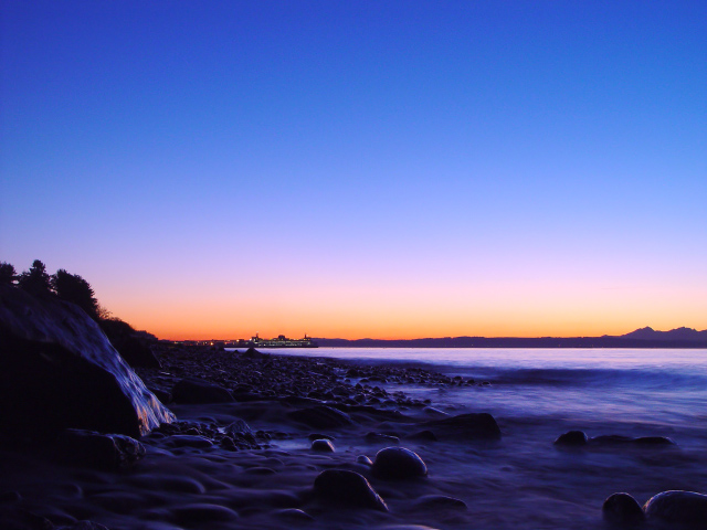
Simply a wonderfully composed shot. The colors on the horizon help to divide the frame, and the fall on the left really anchors the shot well. I also think it is very effective how the water line begins on the left, curves toward the middle, then back to the left at the bottom. That gives the shot a very dynamic feel to it. The ferry in the distance is perfect for giving the picture soemthing other than gorgeous colors to look at (though that would have been enough!) At first, part of me thought you needed to crop out some of the sky, but when I look at it that way, it looses some of its punch. The brilliant blue really makes the other colors have punch.
TECHNIQUE
I really cannot think of any suggestions to give you to make this a stronger picture technically. It is beautiful like it is. The exposure is right on, allowing the colors to be sufficiently captured, while not blowing out the lights, or blurring them in the distance. This would make an awesome poster!
Truly enjoyed it, and look forward to more of your stuff.
First of all, this is a very lovely image. However, when I see an image like this with very interesting foreground elements, I tend to wonder if it may have been better to show even more of it. But since I wasn't there I can't know that. I just love the darkness and subtle highlights that reveal the shapes of the rocks. Is this Seattle? Hmmmm. the colors seem just right, the exposure is perfect and technically, it looks very sharp and clean. Nice job. 9 -T
in photoshop, there is this thing called levels... I Belive if you would slide the "middle" slider more towards the left it would halp with more clarity/contrast in color/brightness on the rocks. I Dont know how to expain it in photography terms, but basicly you need to "allocate" less "bits" to the "black" range and more to the "white" range...
check this out: //umsis.miami.edu/~jjuroch/10788edit.jpg
still gave you a 10 though :)
This is a great shot, I really like the color. The motion of the water is super too. One of my faves this week. The way the color reflects of of the big rock on the left is unbelievable.
Nice Color but a little to much sky for my tast. Maybe could have been cropped to make an intresting panorama. not a lot of cropping, just enough to balance out the colors in the sky.
Beautiful colors! I wish it had something to focus on as the main subject though. The light in front does not really bring out the colors of the rocks and water. Perhaps just a hint of flash would have helped bring something out in front.
I can\'t believe the amazing photographs I\'m seeing this time. I\'m humbled. First of all, the colors are surreal and even more so with the long exposure on the tide. -10
What beautiful colors, I like how you captured the waterfall in the shot. Very crisp shot the focus was still good all the eay to the city in the background. There is almost too much sky in this shot, but I understand to show the color gradient. 8.
Glorious shot, nice inclusion of the ferry! Is this near Magnolia? I just can't quite place it. Damn nice, don't tell anyone this was in Washington! Remember, it rains here EVERY day! (Don't change our story!) 10 Swash
Wonderful sky with silky smooth water and a great reflection on the rock. Wow.
Nice horizon, I think that I like it with and without the boat.
Was this the result of toning or did you use a filter or is this just a great place for a photograper to be at the right time of day?
Colors blow me away!
Love this one. Great colour and use of slow shutter to give the sea a silky look. Maybe a little to much sky, but would look great in a frame on the wall. 10





 Add photograph to your favorites
 Add photographer to your favorites


 Photographer found comment helpful.


