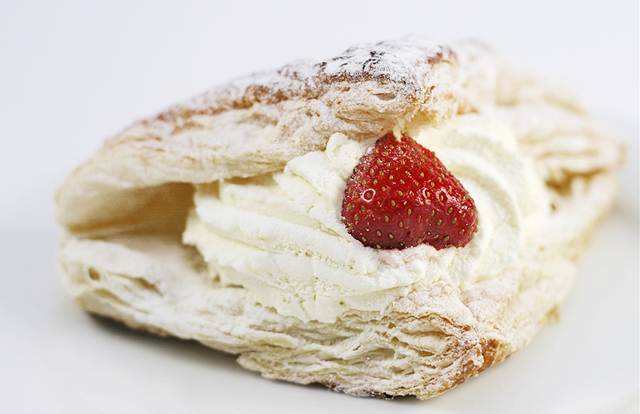
LOvely food shot. Look how many people said they were hungry after voting on this! The dof is perfect, especially for modern menus, cookbooks and ads. What I like best about it is the two points of the crust form a perfect jaw to hold the strawberry and reinforces the desire of the viewer to bite into the sweet. The orientation of the strawberry is the only thing that could have made this better. I have to give you congrats for moving outside your comfort zone and doing something different. For such a light shot, you kept the whole outline of the sweet separate from the background. Awesome light control.
This is a really good shot, but I was so tired of judging photos of food. I had to come back to this one. I think the subject is a little unimaginative for this challenge, but very well taken.
after reviewing my voting i am changing my vote (up don't worry) and its because when i looked @ it the first time i must of been alseep, its a great picture and the compostition and image are wonderful, 7
love the colors, lighting, and subject. it's very inviting. don't like the shallow dof, and probably would like the composition more if it had been rotated slightly to the left.
The high key looking photo is not my favorite thing but I like the way you did this one. You have good detail in your focus area and I like that. The light seems a little harsh on the strawberry. Maybe you could tone it down somehow. Great work! This one should do very well. 8
Lovely food shot. I like the soft lighting, excellent use of DOF, focused on the strawberry. Interesting masters entry, but I like that it is not a landscape or a portrait.
That does look delicious. But a few little things grabbed my attention, one the strawberry is upside down to me. If it was turned over it would look more like a little heart. The white background is very nice but the shallow DOF bothers me for some reason. If it was just a bit deeper it might appeal to me more. I started at a 7 but am raising to a 8
An 'in your face / in your mouth" view? I don't think I'm finding this very appealing looking as I don't like the point of view. It's got great amount of detail, but for one, the DOF is too narrow and I think you should have gotten all of it in focus. Secondly, I would have preferred some kind of contrasting background, either in color and/or another lesser subject. As it is, all this white just hurts my eyes. 5
Tasty! This shot is simple, but technically well done. The lighting and focus are good, though a slightly deeper DOF would have kept the left side of the dessert in focus... but that'd be the only change I'd make on it.
Food pictures go from good to great when they make you want to eat the subject. That requires a tasty subject, a technically superb shot, good composition without any distractions, and of course, a clearly focused point of entry. 10.
I look at this over and over again. I do not like the dof because it fades into a blur faster on the right than on the left. The strawberry is on the money in texture and exposure but the image does not entrain my attention. Yet it does have a very pleasing center with shade, colot and textures. Bumping up to 6
Mmmmmmm. yummy. . .and very naughty. I like this picture a lot, but I'm wondering if the subject being white-ish, if a more contrasting background would have worked better? It's a great picture though. 7
The pastry seems a bit lost on the white background, may have been better on something else. The strawberry shows nice focus but the glare is a little distracting.
Yum!! Very nice shot here, excellent lighting and DOF used to get an all white background. Might have liked the strawberry to have been rotated 180 degrees to make it look more like a loveheart. 9
Oh that looks yummy and makes me want to go find something in the kitchen to eat. Very good application of DOF to emphasize the three main textures: puff pastry, cream filling and the strawberry. Lighting seems a bit bright to me and contrast is a bit weak and undefined. 7
I like the way the subject that you are focused on is off center in the picture but I would like to see a deeper DOF and maybe a little more color in the strawberry. Otherwise a very pleasing picture.
lol very nice photo and interesting title... i love the change of focus through the varying depths of field and the texture/ lighting... all that is excellent :D the only possible thing to change is possibly to the right of the sweet.... there forms a slight shaddow and that could possibly be cloned out...
however in case you havent gathered yet.. these are all only possibilities... and im not too sure that they would improve the photo though its a comment that may or may not help but its a consideration none the less...
hope it helped -_-' congrats on a wonderful photo though
This shot doesn't really do a lot for me, but is well taken, evenly lit, effective background, good use of dof. There's a bit too much glare on the strawberry which you could have removed with a polariser. 6
This looks like a magazine image its so well done
You have shown the different textures, pastry, cream and Icing sugar very well
Nice work and yummy as well! I could eat that right now! Did you make it?
This shot makes me hungry! The only think I disslike about this shot is that its too white. I thought at first it would do well against a black background, but that would cancel the pristine effect it creates and void the "nice" part of the title. 6
I think the key may have gone a bit too high... Looks like it's dancing on the edge of texture loss near where the DOF cuts off on the right. The off-center placement of the overall shape (not the strawberry) feels a bit awkward and out of balance.
I really don't like the shallow depth of field here. Maybe just bit too extreme. Not sure if you're going for a high-key look or it just seems a tad overexposed as well (4).
Got a craving ... went down to the cafeteria to look for exactly this. If this were an ad, you were successful in enticing your customers. Food photography is very difficult for me to achieve.
An attractive image to me, appealing, but no WOW factor. Could be used in advertising with some more empty space around it. Technically I cannot suggest any improvements. Nice clean background. Good focus on the strawberry, nice depth of field and blur, good soft light without overexposed white parts.
I have found doing food photography to be very difficult, so I am always impressed by people who can do it successfully. I think you have done this here with the pastry looking very appetizing. Your presentation, using not other distracting elemnts lets me focus on the subject with the berry being the predominant visual draw. The hot spot that forms a ring around the seed on the left side of the berry is one small distraction. I like the use of shallow DOF here. nicely done.
i think more dof would have been a little better - there would have been more in focus to look at ... the strawberry alone doesn't hold my attention very long.
Yum! That looks delicious. I think to finish this shot off nicely you sould dodge around the edges to make the background white rather than grey. Technically good, but nothing that makes the shot stand out amongst the crowd. 6
To me, this is missing that certain "wow" factor (to borrow from a DPC "standard"), that gives me incentive to score higher. the narrow DOF is a little distracting in this case, especially because of the hard lighting on the right hand side. The off centered composition also doesn't work to me, since the way you've posed the pastry already suggests a lack of symmetry, which, if used in a centered comp, would have worked quite nice. Also, somehow, the color just seems a little flat. the whipped cream in which the strawberry rests just doesn't stand out the way it could to make the statement I feel that I want it to make.
Still, it's a great attempt, and now I'm craving yummy pastries!






 Add photograph to your favorites
 Add photographer to your favorites

 Photographer found comment helpful.


