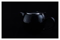
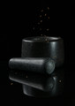
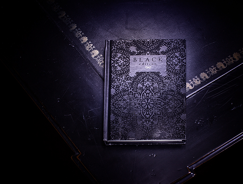
I really like this entry. The unexpected touch of the name of the book , shows that you went out of your way to put some soul into this challenge. Black is a really hard colour to shoot with and edit, as you can see with your tinge of purple. But you have a fabulous colour in that purple, it is a deep rich vibrant black/purple, very much and similar to a Walker ink pot ink. The only real thing I will nit pick on is the red lines on the desk on the left hand side, it works on the right as it shows the ridge detail of the desk, but as it has totally faded back into black on the left hand side, it is just coming up as red lines. Fantastic job, you should be proud.
Good idea. Probably not a big deal, but I would have liked to have seen the book edge on the left vertical, and the scratches in the (desk?) detract from the overall image.





 Add photograph to your favorites
 Add photographer to your favorites

 Photographer found comment helpful.


