Thanks for your critique Doug, it's very helpful. Because of your comments echoing other things people have said about the colours in the photo, particularly the sky, I posted in the forums about "Light and the Australian landscape" - //dpchallenge.com/forum.php?action=read&FORUM_THREAD_ID=12204. I hope this helps you and some others to understand why I like the colours in my photo the way they are :).
Initial thoughts Very nice composition, meets the challenge, could be a bit brighter
Composition/ Content
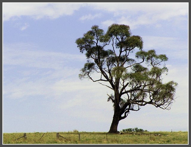
I think you did a great job on this shot. I love the way the tree is leaning towards the right edge as if it blowing out of the photo. The ground is perfectly horizontal and the fence in the forground adds character.
Background Either a polarizing filter or an increase in saturation and perhaps contrast would have brought the blue sky and clouds out which I fell would have really improved this shot.
Camera Work - Technical Focus seems good but not great (more about that later). The only other thing you might have tried would be a different time of day so that the sunlight hit the tree at a different angle. I can envision a late afternoon sun hitting the tree with those bright warm colors that would have given you more of that "Wow" factor.
Digital Processing - Technical I noticed that you only used 110 kb of the 150 allowed. That may have been enough to sharpen your focus on the tree a bit. I don't know how much sharpening you did in post processing either but I have a good article that I would share with you that really helped my sharpening in post processing. Let me know if you are interested.
Fits The Challenge Definitely fits the challenge well.
My Opinion On The Photo I originally scored this shot an eight which is one of the higher votes for it. I have done a lot of Bonsai work so I am a sucker for old, gnarled trees. I think that it meets the challenge well but could have been improved a little to finish even higher than it did. Good job, and keep up the good work.
I would be happy to talk further about this shot if you would like to contact me.
DougPaz
I'm very surprised this didn't do better. It probably lacks the 'wow' factor people might be looking for after voting on 150 landscape submissions, but this photograph really has character. I think it would also look good with the levels pulled up to very bright, bold colors, but your choice of effect is also very effective. Great job.
Really great concept, that tree all mangled from the wind, standing lonesome against the skyline. At some points the tree looks to be a bit fuzzy and out of focus, but that could also be the texture of the tree tricking my eyes. I think the framing great, although there is a bunchof dead space, without it this picture wouldn't work. 7.
Great choice of framing ... put the tree exactly where I\'d want ot see it. Good job at minismising the foreground, with just enough of the fence to make it interesting. 9. Would be spectacular if the sky was more bright blue (something to add on with Photoshop, and hang on your wall). Good job. Jacko.
I like the texture of the sky (could be a little darker though to show the blue parts better) the tight cropping at the bottoom and top and of course the center topic of your picture, the tree. It might have been nice if there would have been more room to the left and right to strengthen the feeling of space though. Still very good and a 8 from me.
Great shot. I'm a big fan of solitary tree shots so I'm bound to like this. Good composition. The tree is in just the right place, and the foreground with the fence running just above the bottom of the frame is perfect.
Your composition and framing is very good - especially having the tree on the right edge given the way it is wind blown. The photo looks just marginally out of focus - perhaps a tiny bit of camera shake. The border suits the image well.






 Add photograph to your favorites
 Add photographer to your favorites


 Photographer found comment helpful.


