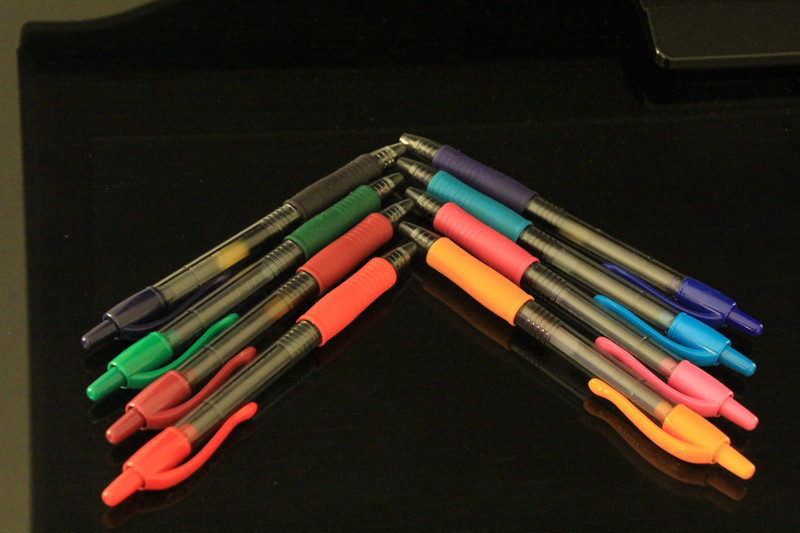
Good use of colourful, everyday objects to create some visual impact, but the image needs some tidying up. The intruding surrounds could have been cropped off and some noise reduction would have helped.
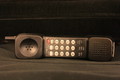
Good idea but the edge at the left is taking away the attention from your subject. I like the approach, but I feel there was more to get out of this. Of course, this is only my personal opinion.
Your idea is fine, but the execution leaves a lot to be desired. The background is cluttered, there is a yellowish color cast, and not great focus. Take a look at some of the previous similar entries for ideas on improvement.







 Add photograph to your favorites
 Add photographer to your favorites


 Photographer found comment helpful.


