|
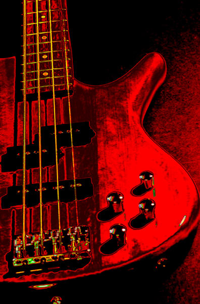
I think the biggest things that were a detraction to the image is that it has a digitized/posterized look that many don't find appealing. PP brought out some harsh shadows that lose a lot of the potentialy lovely details from what you might have had in the original unprocessed one. The colors seem 'off-key' ;the yellows of the strings are harsh and clash with the red IMHO. Lastly, angle of composition - straight on shots like this add no or little draw for the eye to stay and linger awhile. Compose the shot with an interesting angle can add drama. Hope these critiques help. |






 Add photograph to your favorites
 Add photographer to your favorites

 Photographer found comment helpful.


