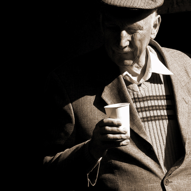
The lighting and shadows contrast well. The use of negative space also focuses the attention on the man's face and cup. The only suggestion I have is to darken the cup a little so as not to draw attention away from the eye. My gaze is drawn first to the cup due to its luminence (spelling?) within the scene.
I must compliment you on the lighting in this shot... this has that soft yet real quality of truly classic portrait shots. Thanks for sharing such a thoughtful picture.
Very stark use of contrasts here. I like the sculpting your lighting accomplishes, but I am tempted to think that the lines between light and dark are a bit abrupt and harsh. Still, nice capture of an interesting person and moment.
good use of light showing one eye fixating and highlighting the "character" in his face. The hand -cup is a little over exposed IMO; overall a good character study. Congratulations.
I praise you for your selection of subject. Very good composition with the aid of shadows. The light is harsh but it does not kill the texture in the old mans clothes. I can almost feel the fabric. The cropping is just right and I like that you choose to crop the middle of the hat and the top button on the jacket is a must. The lighting on the fingers is fantastic. Very good work. -10 (I just gave two 10s)
At first I thought the shadow is too deep - especially on his face. After the second look I like it a lot. Moving the model to the most left side is a great idea :)
Striking contrasts and great composition. Tone is very suitable for this shot.
Not really sure the title fits to us outsiders, and suspect that there was a cider press nearby. Well Done. ((8))
Superb portrait - excellent use of "strage" lighting. Printing is also superb - very strong blacks and whites. I'm a little unhappy with the paper cup - don't know if it's the color or exactly why.
Great shot, loads of character in the guys face. Pity we can't see more of his eye though. Undecided really about how he's standing... The angle that he's at just now kind of tells a story, he may be looking in to somehting. If he was straighter, I may not have thought this. Well done! 8
I love this picture. It's very emotive and I'm really drawn to this man. I'm giving this an 8, only because the shadowing off of so much of his face doesn't appeal to me as much as if I could see all of his face.
I hate being this picky but I try to relate the photo to the title in some manner and I just can't do that with this one. I see the man looking at something and I expect to see the cider press somewhere and I do not see it. Maybe I need to infer that it's there because of the type of cup he's holding but I am not sure. All I see are his eyes looking out of frame at something and it makes me want to see what's there. The composition, duotone and strong contrast are this photo's strongest points and they are used to their utmost. 6
Dunno about the cider press, but this is a great candid-type photo! I just love the shadows, and his outfit, too, it's classic! I think my grampa wore that exact hat :)
J.J.Beguin style. I like the great amount of shadow negative space.
Shame the "glass" seems to be a plastic goblet. The title explain the action, I wonder if you could maintain the great qualities of the photo with a composition showing the cider press?
Very nice shot, but I wish the face was as sharp as the suit, the texture you've captured is great! I'm not really sure a square crop works for me here... I think your idea may have been to have the cup as the pof using rule of thirds, but it is the face that I focus on, and it seems awkwadly placed in the frame. I would have liked the face just a bit better lit... the brightness in the rest of the frame is quite distracting. A nice moment captured though. 7
nice tones, though it could use a little extra contrast in my eyes. Beautiful diagonals, and i love how they follow his gaze. very very nice. bumped to an 8 because it makes me smile.
i like this photo alot, particularly the colour and the shadows being cast! though the only thing potentially that may be changed IMHO is to slightly crop off the left hand side of the photo - being rather dark it seems rather consuming... possibly a bit over powering? i feel that if it was slightly removed it would give the photo a more relaxed atmosphere though i cant say for certain until i see the byproduct :) hhehe gr8 photo over all and a highly commended acheivement :)
Somehow the strong contrast works on this. It brings out the signs of age in the man's face. I might have cropped a bit off the left to focus even more strongly on the man.
Ten. To me, this is perfect. I have been trying to shoot a photo like this but have had no success. But at least I can find a good example to emulate. This is just so beautiful - very distinguished-looking model, beautiful contrasts, lighting, diagonals, shadows ... I can go on and on.
a great character study. excellent light with a very wide tonal range. the highlights a blown on the cup and his collar, but I think it still works very well in this shot because it is composed so well otherwise.
I like this portrait. There's good detail in the jacket and sweater, as well as his face. The only think I think could be better if the cup weren't a paper one. 7
A truly sensational portrait, but I wonder if the shadows are just a bit too deep. His face is clearly the most expressive element in the composition and it may be just a bit too indistinct.
I really like this image the textures and the detail and the half light shadows are excellent
I also like the title assuming that is what he is looking at when we cannot see anything it gives it a nice twist and good interest
The only thing I think would have been nicer is for him to be holding his favorite tankard or glass rather than the paper /plastic cup
Excellent portrait. What an expressive subject. I think the shadow goes just a bit too far on the dark side. I would have liked to at least make out the outline of the other side of his face. 9.
returning for comments.
This is a very nice character study but the viewer immediately tries to guess what bevarage the cup contains. Which brings the eyes to the blown highlights on the fingers. Yet this image remains strong and the lighting accomplishes its intent for the overall feel. Very well done.
Nice negative space and clarity/tones. Sorry, but paper cup really pulls me out of the picture....ugly anachronism which spoils the effort you have obviously put in.
the facial detail that's visible is very nice - I want to see more - too much negative space for this type of photo, in my opinion, probably due to the direct sunlight vs the heavy shade
Good application of shadow, negative space, and off-screen expectation. Effective use of available light to create the effect of stark single-source illumination.
I love the composition and lighting on this one. I'm not even sure if he is smiling but the way this was taken, it appears that he is very happy. Great job.
While I like the lighting, there are a couple shadows that I wish weren't there, and I supose you can't have both. lol. The shadow from his collar is so very sharp that it draws my attention greatly. And I wish I could see his eyes. He's a lovely old man. Much personality in his face and lines. It makes me smile. ~Heather~
The longer I look at this image the more interesting it becomes... The highlights are a bit harsh, but it's a very compelling shot for its emotional appeal. Great work!
I don't the name of the technique used here but I like how his face, shoulder, and arm disappear in the shadow. One thing I find too noticeable is the dodged eye and lips (5).
I love the use of shadow to create an interestingly shaped negative space area. It makes the portrait more interesting overall. My only criticism would be that I can't see the detail of his eye, which I would really like to be able to see more clearly. Black and white works well with the subject. 8
This is a great image. The textures are phenomenal. The only thing I don't like, which is of course a matter of opinion, is the shadow and lighting on the face; it gives the appearance that the cap is sort of floating in mid-air. The focus on the face is also a bit soft, which I understand is intentional to bring the eye to the cup which is the actual subject, but the light combined with the focus makes it hard to read the man's expression which I think is an important part of this sort of image. Nonetheless, this is an outstanding image. 9
What stands out in this photo for me?
Lighting and texture. The strong side lighting adds shape and depth and brings out the textures on your subject. His face, the cloth in his sweater and jacket.
Very nice photo especially use of available light.
I LOVE these kind of photographs - I wish I could take more myself! I love the positioning of your subject and a great use of negative space. Great sepia toning! Congrats on a fantastic shot!!
Wow, really love this one. Like one of the classical masters. The hard shadow fits perfectly with the pose, with the diagonal created by the arm. Great empty space as well. I don't like the title, it explains too much what is going on, while the image is open for so many interpretations. I think you should have left the viewer wonder what he is looking at or what he is thinking about.
Lovely detail and toning. Excellent composition. I like how the light falls on his left eye, and it looks transparent, while the other eye is in the dark. There are many good shots in this challenge, but this is one of my favourites (for what it's worth).






 Add photograph to your favorites
 Add photographer to your favorites

 Photographer found comment helpful.


