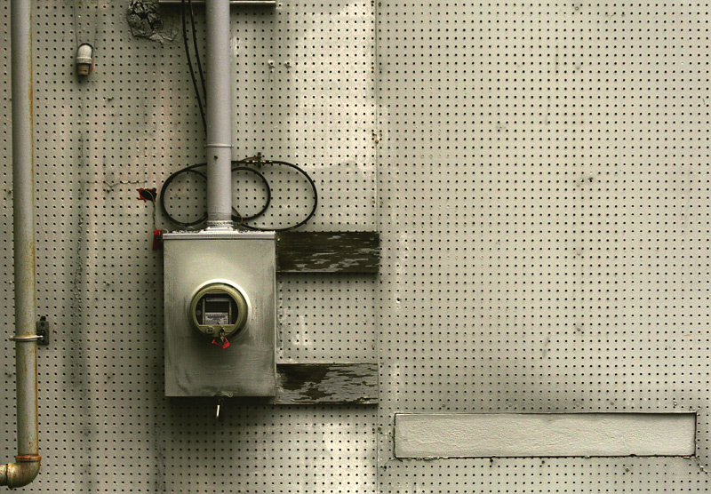
It's a smartly composed graphic composition. What's striking is the contrast between the cluttered left side and empty right side. More striking is that this completely haphazard arrangement somehow feels perfect -- as though changing or moving any one thing would make it fall apart. The sickly yellow-green is relieved only by some splatters of red on the left side. The self deprecating title, in spite of itself, makes us look longer, harder. This is right up my alley. I like it a lot.
A self defying piece, that may demonstrate that visual art may be boring to the blind. This specific piece however is not boring even to blind people, if instead of taking a picture of it, you cut it off the wall, frame it, and make sure no glass separates it from inquisitive hands. Then even blind people can enjoy the raggedness of the surface, the different shapes and materials composing it, and imagine what the artist may have meant, what she saw and what she missed, not bothering at all whether she meant to fool them. As they know well that once the piece is done, it is theirs to interpret and enjoy as much as it is the artist's. It is a pity they will not be able to appreciate the red spots.
Good eye squaring up the essentials and allowing the off-line pipe to provide essential imperfection. Tones and precision of details work to create a real vs abstract modernist nonobjective construct. The tension is surprisingly effective on repeated viewing. 8






 Add photograph to your favorites
 Add photographer to your favorites

 Photographer found comment helpful.


