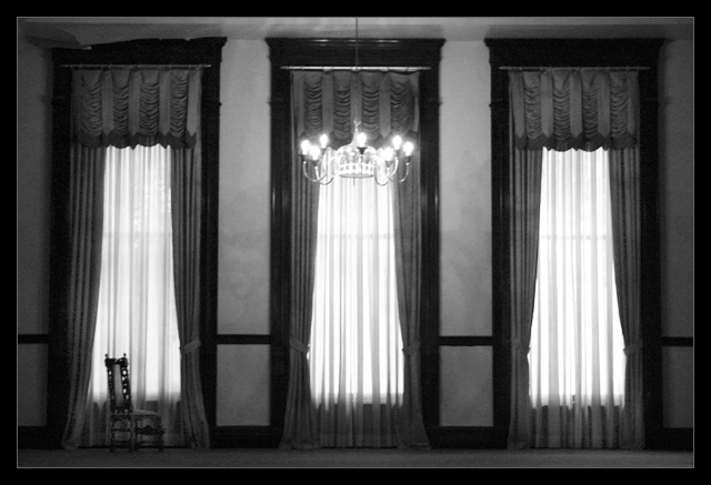
After the challenge: In this photo, I wanted the viewer to imagine, rather than "see". I think Spazmo99 summed it up in the most basic words "Nice tension created by the absence of the subject that was sitting in the chair", although the chair is a symbol that represents whatever the viewer wants. Entering this into Masters, I thought it would end up with an average lower than 6, but I wanted to challenge the viewer to imagine, so I wasn't worried about its placing.
The photo may be boring to most people, but I knew it would be, because not many viewers will make something out of it, it doesn't hit you in the face like the average DPC photo. If you break it down, its just a bunch of windows and an empty chair, lol, but the challenge was to have you make something out of it, write a story, a scenario, or even relate it to your own life experiences, and i'm happy that some of you did!
Concerning the soft focus, I didn't sharpen the photo because it would have lost its haunted feel.
Thank you all for your comments, wether you made something out of it or not, thanks to those who liked it enough to add it to their favs, and a special thanks to Julia (grigrigirl), as i've never had someone tell me that!
Expand your imagination...
- Thamer
Statistics
Place: 57 out of 69 Avg (all users): 6.2662 Avg (commenters): 7.5410 Avg (participants): 6.5263 Avg (non-participants): 6.2232 Views since voting: 1675 Views during voting: 866 Votes: 402 Comments: 72 Favorites: 12 (view)
This is a very good image and underrated imo. First I gave it an 8, but I lowered it to 7 after viewing it again (sorry). I like the motive and the composition in it. I think this could have done better as a duotone image with some levels work. Otherwise a well seen motive, I really like it. It should have ended up in 11-15th place imo as it is.
You should take more pleasure that for some of us - myself included your intended "In this photo, I wanted the viewer to imagine, rather than "see" worked.
People on DPC sometimes just look at aesthetics rather than what a photo does to them.
I hope you dont mind...but I feel the need to add lyrics to this image. If it bothers you..pm me..i'll delete them. Each time I see this image, I am reminded of the Lyrics to POE..."haunted". A song that touches me deeply...and this is the perfect image to convey such emotion....
Haunted
Ba da pa pa ba da pa pa...
Come here
Pretty please
Can you tell me where I am
You won't you say something
I need to get my bearings
I'm lost
And the shadows keep on changing
And I'm haunted
By the lives that I have loved
And actions I have hated
I'm haunted
By the lives that wove the web
Inside my haunted head
Ba da pa pa ba da pa pa...
Don't cry,
There's always a way
Here in November in this house of leaves
We'll pray
Please, I know it's hard to believe
To see a perfect forest
Through so many splintered trees
You and me
And these shadows keep on changing
And I'm haunted
By the lives that I have loved
And actions I have hated
I'm haunted
By the promises I've made
And others I have broken
I'm haunted
By the lives that wove the web
Inside my haunted head
Hallways... always
I'll always want you
I'll always need you
I'll always love you
And I will always miss you
Ba da pa pa ba da pa pa...
Come here
No I won't say please
One more look at the ghost
Before I'm gonna make it leave
Come here
I've got the pieces here
Time to gather up the splinters
Build a casket for my tears
I'm haunted
(By the lives that I have loved)
I'm haunted
(By the promises I've made)
I'm haunted
By the hallways in this tiny room
The echos there of me and you
The voices that are carrying this tune
Ba da pa pa...
Father :
What is it Annie?
Daughter :
You think I'll cry? I won't cry!
My heart will break before I cry!
I will go mad.
mixed lighting grabs my attention....... in this vacant but ornate room. Nicely observed setting, and thoughtful composition with the light on and the chair facing a window indicating the "haunting" presence.
Strange, voted this a 7 while voting... Now returning for comment and seeing the thumbnail it looks like 3 white dresses of 3 ghosts....
Upping to 8 for making me rethink...
Interesting, stark, simple image. I like the symmetry and use of pattern and texture here. I'm not "wow'ed by it, but I think many people might be. Good, solid photography here.
this is a wild image. even without the title, it has an erie feeling to it. you can really feel the distance between you and the window. great job. good luck with the challenge!
Very artistic - I love the use of the windows and light as shapes in the composition and the placement of the chair and chandelier, giving it just the right amount of balance. I'd like it to be a tiny bit sharper, but still a masterful piece of art. 9
This images is great. A high ceiling, gown like curtains with backlight, in this case, outside light. The tones are just smooth. Many amateurs fail with this image because they forget the importance of holding the camera's sensor parallel to the wall. It has a much classier feel then Hotel California. While this image is a great mood setter, it gives the viewer no distinct sense of texture. It is beautiful and leaving a lot to the imagination. Bumping up to 7
Eerie. One of the few photos I've ever seen in which you can almost hear the silence. Focus is a little on the soft side for my taste, but adds a ghostly glow. Just noticed the crumbling ceiling on the top left, which seems out of place in this otherwise well-maintained room. (8)
It's probably due to resizing, but it could be sharpened a bit. I like it a lot, it has misterious atmosphere, but I would like to try and leave only the left window with the chair. I wonder how it would come out?
7. I gave bonus points because the image isn't barreled in any way. I wish it was a bit crisper but the mood is well delivered. The frame, for once, helps.
I realkly want to like this image - it has some neat features. But - I just don't quite connect for some reason. The empty chair is significant yet seems to be such a small part of the scene. With the strong back light - I'm not sure the lit bulbs do much except draw the eye away from the other nice areas. Finally - a very small point, but the border is overdone for my tastes. Perhaps the reason I don't connect is that it doesn't seem right to scale - if the chair is normal size - the ceiling must be 20 feet.
The b/w effect add to this "haunting" peice. Well portrayed, lighting perfect, and shines in the midst of this challenge. Looking at the photography of the "master's" you can almost tell who took what shot. Very well done! (congrats on previous ribbons) ;-)
I actual like this a lot, but don't expect it to be in the top 10. It is a little soft but i think that adds to the scene.
This is the only photo in this challenge that makes me stop and think what is behind this photo, where is it, why is the chair there what is the photographer trying to say?
Very nice softness, though a little on the bbbbbright side...I'd like to actually see the chair more...but great on symmetry and contrast...enjoyed! Thanks!
This is an amazingly beautiful shot and without even looking at the title, this is exactly the feel I got from this image. I like the softness of it and the b&w treatment is very nice.
VERY nice shot, the composition is just superb. My eye is led around the various elements, but never wants to leave the frame. There is a sense of real perfection about the ratios here. The chair is the element that really makes this shot. The frame balances the photo perfectly. Exposure is spot on. I think I'd have liked a tad more sharpness... the blurriness here doesn't quite look deliberate enough. Nonetheless, this is one of my favourites this challenge. Thanks! 10
I love the composition of this, but the lighting seems a little harsh, and the clarity a little low. The lone chair.. I dunno, I'm up in the air about that.Also, and you can't really help this.. but the left window, at the top, detracts a bit because of the lack of symmetry. 7
wow lovely photo, i love the solitary chair and this is one photo where i believe that the border adds to the overall effect... i love the tones and the light saturation, i believe this photo should be VERY well placed and i look forward to seeing more of your work once i find out who you are :P :) and if i was to be picky (after sitting here looking at it for such a long time) it would be with regards to the far left window right up the top... the shadows cast or the frame or whatever it is (cant be too certain) is not the same as the other ones and slants although this does not ruin the image it does provide a drawing point to take my attention away from the photo as a whole ( and maybe i just have a short attention span :P) but overall VERY good photo and look forward to seeing more of your work
Can see what you've tried to do here, but I think there are a few things that I personally don't like. The lights are still on in the room, it looks like there is enoughlight coming in through the window. The shot seems a little soft, I'd have liked a DOF that makes everything crystal clear. 6
beautifully lit and well composed. I like how the symmetry of the 3 windows is offset by having a contrasting element (chair, chandelier, nothing) within them. very nice.
I gave this photo a 9. I love the composition. What keeps it from a 10 for me, not at all trying to be critical, is the top of the left window frame has something hanging in front of it. It is a little distracting to me. Nonetheless, a great photo!
I love shots like this. The only thing I don't like about this one is the location of the chandelier. It seems to merge with the light windows a bit too much. Not really sure what could be done about that though. The composition including the chair is great, and I like the title.
An interesting perspective but it does not have the WOW factor need to keep me interested. It also seems way too soft or even out of focus, not sure wich. 5
Wow! I really like this photo. There has to be some sort of story behind this, I'm just not sure what. Either way, it's one of the ones I would consider hanging on my wall. 8
I think you did a great job conveying your impression of this scene. The b/w, the cropping, the position of the chair all done with precision. Nice job IMO.
Hmmm. This picture is very well done. The black and white really work, and the focus is great. I'm giving it a 6 though, only because I don't really understand what it is about.
I like the mood conveyed by this image. The empty chair is quite subtle within the overall image. It also works well to counter the symmetry of the windows. Focus feels soft to me. 7 (//www.dpchallenge.com/forum.php?action=read&FORUM_THREAD_ID=129433)
Great use of visual repetition to create an expectation for the viewer, only to find the empty chair. Very effective at conveying your emotion from the title. Good contrast and balance, and effective use of long focal length to keep spherical distortion to a minimum.
Pattern, lines, and the strong sense of balanced "centred" composition are enhanced by the chair and chandelier as pleasing "disruptions" to the sense of pattern and order.
The chair being empty does create an eriee absence! Well done. -8
Excellent use of lighting and perspective to give this the eerie feeling suggested by the title. The symmetry of the windows adds balance and strength the composition while the chair slightly throws off that balance - very nice.
I like it that this image makes me wonder what is going on, what is the story behind it. It looks overall slightly soft. Also I find my eyes moving back and forth between the lights and the chair and, considering your title, the chair should maybe have had a more prominent position so it becomes the one and only focal point.
This is a great shot, something like I would expect to see in a film. It's a bit blurred but I really like that about it. It's imperfections give it a haunting character. 10
Very nice, different from most DPC shot's i've seen. Great composition, good framing. The chair gives it the extra point. Maybe a bit soft, but I love it.
The displaced molding on top left corner and missing sas on far left drape are distracting. I like the symmetry. The b/w anf lighting definitely relays a haunting effect.







 Add photograph to your favorites
 Add photographer to your favorites

 Photographer found comment helpful.


