Another one that seems so close, yet not quite right. But I have a feeling this suffers with the 800 pixels and would be much better at 1200 or 1400. I'm also curious what it would look like with a little less foreground. Just a tad less. -7-
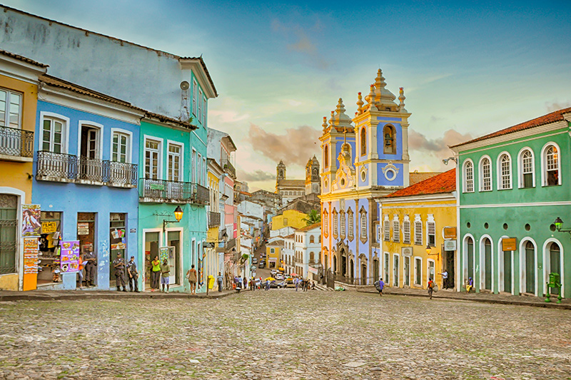
Love the pastel colors of the town square. The soft hues in the sky above makes me think that this is morning - just when the city streets are starting to waken. I love the colors but I think it could us just a touch of contrast shadows to make them pop. It took me a bit to figure out why this shot is just good and not fantastic (i.e. an 8 or 9). The light tones of the street compete and diminish the impact of the pastel colors of the buildings. There are two things that I suggest that can help boost the visual impact more. The first is to crop a little more out of the street - not all of it - just some as that it takes up about 1/3 of the composition. The second is to select the street, feather your selection to avoid hard edges, save selection, open it in another layer over the photo, lower the opacity in the blend mode (20 - 40%), and fill the selection with black. That will darken the tones of the street so that it can allow the necessary contrast to make those colorful buildings pop. Legal in Advanced to do. And you might want to play with the different layer modes (Normal, Luminence, Overlay, etc) to see what works best.
Love the colorful buildings but the PP is very strange, almost cartoonish, unless that's how you wanted it. Would love to work on the original to see what I could come up with.






 Add photograph to your favorites
 Add photographer to your favorites


