Critique Club Review:
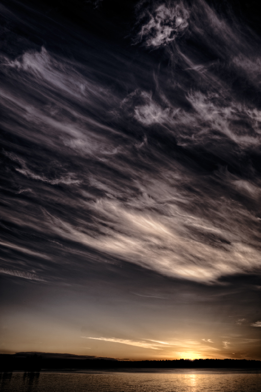
Color Saturation and Hue: Seems a little de-saturated to be realistic. However, your comments do not say what effect you were going for. Based on the title, the de-saturation works well, as a more colorful sunset would have competed more strongly with the clouds.
Brightness and Contrast: The brightness and contrast are appropriate for the subject. Though the sun is a bit bright for me. However, there is not a lot to be done about that, given the sun's position in the sky.
Focus and depth of field. A nice sharp image. Depth of field does not come into play in this image.
Composition: I think the coulds are excellent. I would like to have seen this sky just a few minutes later, when the sun is even more hidden. I suspect that it (the sun) would have been less of a distraction, and made the clouds an even stronger statement in the sky. |







 Add photograph to your favorites
 Add photographer to your favorites

 Photographer found comment helpful.