Critique Club comment by Grayce M. Dillon aka Gracious
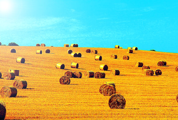
Although this is a very familiar scene to me, having lived many years in rural upstate New York, it has a surrealistic quality to it.
There are many hay rolls, yet it is a simple composition and very appealing.
The coloring and subtle shading is fantastic. It is sharpened to the point of bringing the texture out in the field beautifully.
I can see the point some have made about the glare in the upper corner perhaps being distracting. BUT....it sort of adds a little heat to the image...making it even more surrealistic.
I like it...this is very artsy. Keep up the good work!!!
Regards,
Lovely subject, and lovely vibrant colours. My one biggest gripe is with the left hand corner at the top. I think maybe it is a bit over exposed, and the rays of the sun make the colours on the left hand side quite faint. -Annida
The landscape itself looks pretty dull. Add the round bales and you got yourself a pic!! Nice colors. Looks like the upper left side wanted to glare a bit - Inspzil
Nice colour, but the sun flare does not add to the photo. There also appears to be too much grain. Perhaps a lower ISO would have been better and positioning it a little more to the right to get the sun out of the frame.
The composition is wonderfull and you have choosen a great topic. In my opinion it could have been improved by choosing a darker and deeper blue for the sky, but maybe this was not possible. Together with the yellow it looks a little artificial to me. Also the bright spot from the sun in the upper left corner does not add something in my opinion. Still a great picture for its topic and a 8 from me.
If that one could be re-shot my advice would be: get closer to some of these and have more fun composing with these shapes in different sizes and keep just enough sky only to mark the horizon. 7
I like it. Love the title too! The sun washed out the left side of the the picture a bit too much, and you could probably crop a bit of that out. But other than that cool shot.7.
Beautiful composition, but the colours seems off, especially the sky. The sun's glare on the left side unfoirtunately washes out the colours on that side. The colours on the right side are very rich and deep. Beautiful. I guess maybe next time don't shoot into (or so close to) the sun. Saturation is also maybe a little too much.
I sense some image manipulation here, but whatever the case, the flare from the sun makes the image unevenly lit on the left side. Other than the flare, a good fit for the challenge and a nicely composed shot.
Lovely subject, perfect for the challenge, one big problem I see here was that you were shooting into the sun which caused the white spot more in the left hand corner... too bad, because I love the rich colors of the land, and the sky. Also I think your horizion is a little tilted.... fixing that in photoshop might have worked... cool idea though.
Very interesting photo. The chaotic placement of the hayrolls makes a nice composition. Too bad it's a little overexposed at the left because that kinda draws away my attention out of the photo. Besides that, great job.
I think I would like to see the original color to this. Looks too fake like this. I mean, colors are good, but maybe a bit too oversaturated? I love the shot though. All the bales, the smoothe ground and the smoothe horizon line. Very nice composition. Focus and clarity are good, and the angle and framing/cropping are excelent. Color just seems off. Very nice find. Good landscape. Good luck in the challenge.
with you title you pulled the foces from the landscape to the hay, a good title for this photo would have been Rolling Hill , I went through and voted now i am back to correct my mistakes. this is one of 4 photos that i made a mistake on and i am uping your score from a 3 to a 7 good job and good luck
With the brightness in the top left corner, the left half of the picture is a bit washed-out due to the reduced contrast. I think that cropping it to produce a protrait format picture might have worked better.
This is a real winner picture. It looks as though it has been over saturated in post processing, which has really hurt it. It doesn't look natural, Sorry.






 Add photograph to your favorites
 Add photographer to your favorites

 Photographer found comment helpful.


