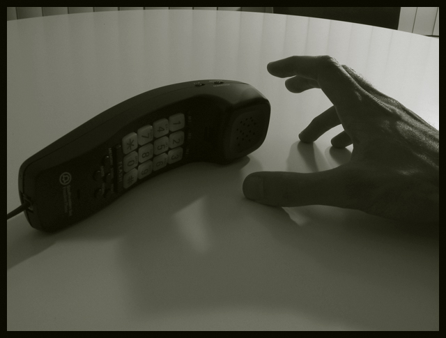
A good pun for the challenge, with several uses of touch. I like the composition, though perhaps I would have preferred more of the hand (to the wrist), and less of a "clutch" pose-touch tone dialing would have been better IMHO. Also, this seems a bit too dark to me (especially by the phone). (By the way, as an international site, some people may not get the AT&T advertisement title.).
Don't know if you meant it this way, but it seems very ominous with the underexposure, the grasping hand, the sense that the phone has slipped just out of reach.... I'll assume you meant all that and vote accordingly (despite the cheeky title).






 Add photograph to your favorites
 Add photographer to your favorites


 Photographer found comment helpful.


