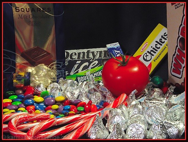
Composition (content) I think this is too "set up", the big black hole between the "Squares" and the "Chicklets" gives it away too much. Another angle, more from above might have given a better, more complete, less obvious view. The shelf suggestion of Indigo is a good one. Another interesting idea is to put it in a sea of M&M's and paint a M&M logo on the tomato. The red M&M color almost matches the tomato's.
The "Kisses" produced a lot of nasty glare and are very dominant in the image.
Good lighting, no nasty shadows.
Background See composition.
Camera Work (Technical) Good exposure, but the foreground is a bit soft. Was this from close by? If so, try to stand back and zoom in to create a larger field of focus (increase the DOF at F8). The focus is good.
Digital Processing (technical) It looks a bit oversharpend to me, a lot of jaggies around the curves of the M&M's and all the letters on the packages in the background. Colors are very good.
The jpeg quality can be a level higher as you have some room for a higher filesize. Stronger compression enhances the sharpening jaggies.
My opinion The concept has some interesting potential, but as it shows too much that it is a setup. I don't have problems with setups.
I like the idea but do think that you tried to show too much. Taking the shot closer or from above and limiting the candy to those not in boxes might have helped. The tomato just doesn't stand out well enough. One tomato in a sea of kisses would stand out more (although that foil is tough to avoid reflections/glare on). Using something to contrast with the red color would help it pop out. Putting it in a more natural setting so that it isn't so "set up" would help too - like putting it on the shelf at the store between the snickers and kit kats or something. Tough lighting - do you try to diffuse it with some cloth?






 Add photograph to your favorites
 Add photographer to your favorites

 Photographer found comment helpful.


