FIRST IMPRESSION:
Horrible shot...what were you thinking???...oops, no, that was your splash of colour photo. This is a really cool photo.
COMPOSITION:
A bit centered, but what can you do...it's a cup :)
TECHNICAL:
Focus is good, dof is good, lighting is good (gosh I hate critiquing your photos...I can't find any faults) :)
ARTISTIC:
Very interesting idea...I would like to see it with a diff cup, one without the yellow handle. I like it alot, and wonder how you did it...so here's YOUR assignment: go back to your photo and post a comment explaining where the diver came from :)
OVERALL:
Excellent
Best of luck in the future. Don't hesitate to PM me if you have any questions about this critique.
Very cool! One of the best effect shots in the challenge! The color of the swimmer and water don't seem quite right, but I won't quibble too much! Score upgrade from 8 to 9. Swash
I like this idea and you did it well. For some reason, the goldish glaze on the to p of the handle is a little distracting to me. I feel this would work better with an all white cup. The water scene is perfect for this shot and the colors are great, but the gold pulls my eye away from that. Nicely done image, though! Good Luck
Smellyfish1002







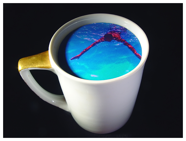
 Stranger In My Cup
 Add photograph to your favorites
 Add photographer to your favorites


