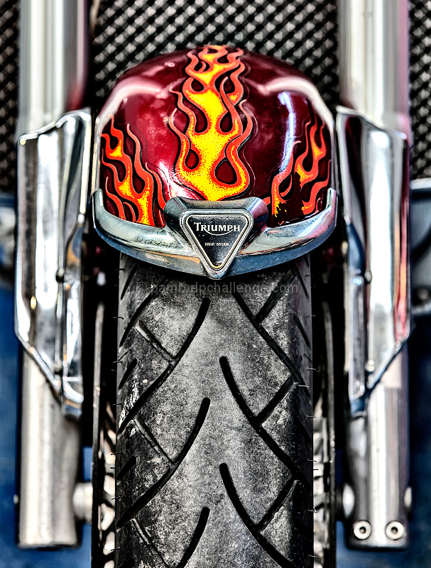
Excellent choice of portrait composition. Those vertical support bars and tire absolutely scream for a portrait orientation. I will say though, it feels really cramped. I don't know much about motorcycles and their riders, but I get the sense that they want freedom and "the open road." With that said, the tightness of the image seems to clash with the spirit of the bike.
Technically, the basics all look pretty good. It appears sharp in all the places one would expect sharpness. The colors are great and well saturated without being too saturated. I really like that hint of blue creeping in. As for the lighting, it's harsh. There's quite a few sharp glares. That's probably one of the more difficult aspects of this challenge, since automobiles are considered nicest when they have shiny chrome and shiny paint. Taking a quick look at some of your other images, I can tell you have, at the very least, a strong natural understanding of lighting. This just comes across as too "in your face." That tightness I was talking about before might play a role in this too though. Would it seem so harsh if there were more wriggle room in the image? I dunno. |





 Add photograph to your favorites
 Add photographer to your favorites

 Photographer found comment helpful.

