Initial: Neat image. Nice bright colors .. like the spiral effect.
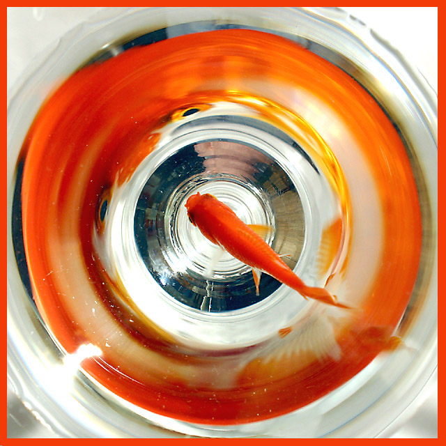
Composition: The fish is basically framed in the glass by the colors of it's own reflection. The direction the fish is facing is like an arrow pointing to the reflection of the fish's eyes. This makes a neat image, but I think the impact could be greater if this were flipped horizontally so that the "arrow"-fish were pointing up and to the right where my eyes would like to read from left to right.
Technical: Lighting is generally good. I don't know if the glare on the lower left could have been eliminated. Also, I believe that is you in the reflection. A tripod and remote might help, also maybe some kind of dark fabric or paper surrounding the glass would keep you or the tripod from being reflected in the glass from the outside. I do not know what is causing the speckles.. lint? dirt? ..... ?
Is it a glass or is it a bowl? Are you looking up thru a glass table.
All this confusion adds to the greatness of the image,.. I am just curious now how you did it.
Overall: Needs some improvement, but overall I really think it is a great shot!
Now that the voting's over I think you should touch-up a hi-res version and make a print...maybe a thin orange strip and a thinker black border would work. It's a great idea I predict will be imitated soon...
too bad i didn't take that bet, Anachronite! I bought a $0.25 fish and put him (her?) in a martini glass, intending to shoot it from the side - the refraction in the glass made most of the pics come out way too distorted and i was at the point of giving up - but when i walked back over to the glass, i saw that from above the element of the glass that refracted from the side REFLECTED from above - i took 3 shots be fore i got this one, which is 98% perfect (points off for the glare and the dust) --- looks like most people were disturbed by the frame :(
Good visual and nicely done photograph. A drawback for me, the orange frame tends to attract the eye to the periphery of the frame when the center of interest is...at the center. it makes this picture a little to busy and a little exausting to look at in the long run. Done in another color or frameless this image would be much more serene.
This is a surprisingly interesting image. It most certainly meats the challenge. On the photo, perfection would have been acheived IMHO if the flare on the lower left edge of the surrounding orange reflection could have been avoided, and of course the many white spots around the same area. I don't believe the orange frame helps in any way; white would aliviate tension in the colour composition. All in all this is my favorourite this week.
This is such a cool shot. The eyes on the side of the glass are killers! Technically there are a few things about the set up that might get dings for, but as I think about them, they are pretty stupid. The glass could have been cleaner or less scratched, can't tell which. The background below the glass could have been a tad less busy, but honestly those are pretty stupid when you really look at this shot. The reflection along the glass is just wonderful, I can't get over it. The reflected fins, the color of the goldfish, back to the eyes, wild eyes. I had started this as a 9, cool shot, considered a 10, but I'll nick you one point for the above trivial minus's (plus the glare in the lower left corner). Nice orange frame.
I try not to base my judging on the border but I think in this instance the border is very distracting. This is a great photo and I think a border is fine as long as it isn't obtrusive.
Interesting. I like it very much. Usually I´m a fan of borders, but not this one. It´s just the colour. It takes away my eye from the fish and that´s not good. A thin border in a grey tone perhaps? Anyway high score from me.





 Add photograph to your favorites
 Add photographer to your favorites

 Photographer found comment helpful.


