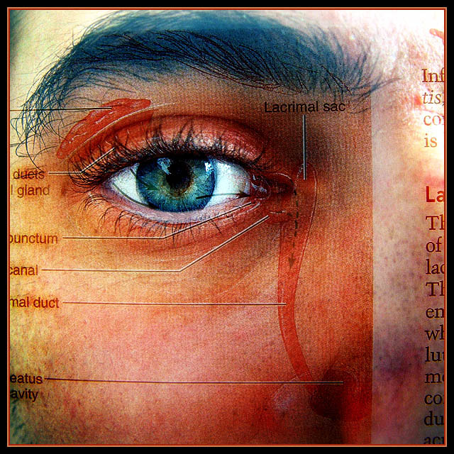
This is a multiple exposure done in the camera and not a transparency or illegal art as many people guessed. Believe it or not I spent quite a long time lining this up perfectly when I realized there were much easier ways I could have done it.
Since people keep asking I'll explain how I took this shot...lol
It's simple, honest, no trick involved.
You know that thing called multiple exposure that allows you to take more than one photo in a single frame...
the thing that I don't understand even having on digital cameras (but am glad I have) since you could do the same thing with a lot more control layering separate images in photoshop.
that's the thing I used.
I took a few photos of my eye until I was satisfied and then I took a photo of a page in my anatomy book. The annoying thing is that I can't seem to figure out how to not use the second image without deleting the first so everytime i didn't get them lined up perfectly I had to start over again. It took me many many tries to get the eyes aligned perfectly.
The unedited version is pretty similar although the colors have been boosted and minor ugly facial and eyebrow hairs removed.
So there you have it. I confess that I have no secret or elaborate setup. In fact, if you saw me taking this you would have thought it was highly unprofessional and that my end result was going to be terrible.
I own no flashy flashes, lighting kits, reflectors, large blank areas of walls or backdrops. This is the closest I come to a studio shot.
I like to point my camera and eye at things that I think will make good images.
Back in the days of film I was obsessed with the multiple exposure function on my camera. I felt like having only one image per exposure was an extremely limiting handicap and I appreciated the meanings that could come to life when two photos were put together.
Of course, I eventually moved to video to satisfy this need for more than a single frame.
Now that we have photoshop we can do whatever we want.
I'm glad I took this the old fashioned way, however. It somehow felt more rewarding and gave it a grainy look it most likely wouldn't have had if I had done it all in photoshop.
Statistics
Place: 4 out of 148 Avg (all users): 6.6218 Avg (commenters): 8.3333 Avg (participants): 6.7609 Avg (non-participants): 6.4950 Views since voting: 3587 Views during voting: 477 Votes: 193 Comments: 56 Favorites: 31 (view)
Very cool. I was wondering which part was your photo and which was the book, thanks for the explanation. This is cool, the colours are great, the blue eyes and the reds as well as the white on the page. Nice, time consuming, but very nice.
I was so convined that this was a ribbon and felt that little schock when it registered four/ With all due respect to the others, this is one of those very strong images that come along very rarely in a challenge. Very good work and to me it will always be a ribbon image. However, where this came from is that JPR creatity fountain which will continue to gush out more gems.
The picture was so good it was hard to believe for many you didn't use Photoshop on it. Simply stunning. Congratulations on the fourth place, but it's No1 to me in this challenge.
Okay, I've got to hand it to you, this is a fabulous photograph, even though I was not impressed by it during voting. It really looks like you simply took a picture of a page in a book. That's amazing and difficult to achieve, but it also still doesn't provide any indication to me that you really created it "from scratch". Just my feelings about this image, I know most people differ.
Congratulations...! But i really wonder how did you shot this picture. I have a finepix s7000. If you can give me some basic details about your shot, i will be happy...
Thanx.
Jason: you are a wonder. I do not know why so many members refuse to extend the courtesy of the doubt when they fail to understand something because it is above their experience.
Anyhow congrats on your 4th placing. I am sure you suffered at the start before validation. Since I am a victum of this I can clearly sympathize with you.
Have no fear..top four shows that the image overcame the skeptics with their 1,2,3,4,5.
Keep up the good work and my kudos for your creativity on this iamge. It rocks.
I have very mixed feelings about this one. It is an excellent image but I cannot for the life of me see how it is anything more than excellent DA. Since I do not know, and I hope to find the how, I will go with the excellence and rank high. Transparency....OK Now I feel better...10.
Great palimpsest!! Reminds me of Peter Greenaway films. Hope this isn't just a modified photo of a text-book...I think more has gone into it. Pushes boundaries which is always a good thing. Creative.
Doesn't feel very photographic to me. Too much like a picture of a page in a textbook. I suppose that's what it is? I need some more artistic elements.
This image fascinates me. I had to think long and hard about my score for it because I really felt I was marking the work of art rather than the photograph itself. I decided in the end that since the main element of the art was a photographic image and that the composition and content of that image appealed strongly that I'd give it a high score anyway. It's one of my favourite three.
This is a great shot. Like it tons. Don't think it needed to be validated, it made sense to me. I have been guessing alot on these now so i might as well do yours too. theodor38?
wow thats one amazing photo very interesting style too! only thing i may change on it - and thats not even something that i would want to majorly change - is reducing the contrast in the top right hand corner at the top of the nose.
I feel its a little bit too bright but overall gr8 work
Wacky shot! I really like this one. The colors and textures are really excellent and you came up with a good original idea for this challenge. Nice job.
This is a very nice image. It seems more like a collage than a photograph. I do realize you would have taken all the pictures and put them together then taken a picture of the collage.. so i am not sure how to vote. but nice collage.





 Add photograph to your favorites
 Add photographer to your favorites

 Photographer found comment helpful.


